Redefining Wattle & Wax, a modern coastal, luxurious and natural brand, that feels calm, centred and unmistakably Australian.
EXPERTISE
Brand Development & Brand Strategy ● Packaging & Design ● Artwork
Cardboard Engineering ● Print Procurement
Production Management ● Product Photography & Styling
AWARDS
Commended Mark, World Brand Society 2026
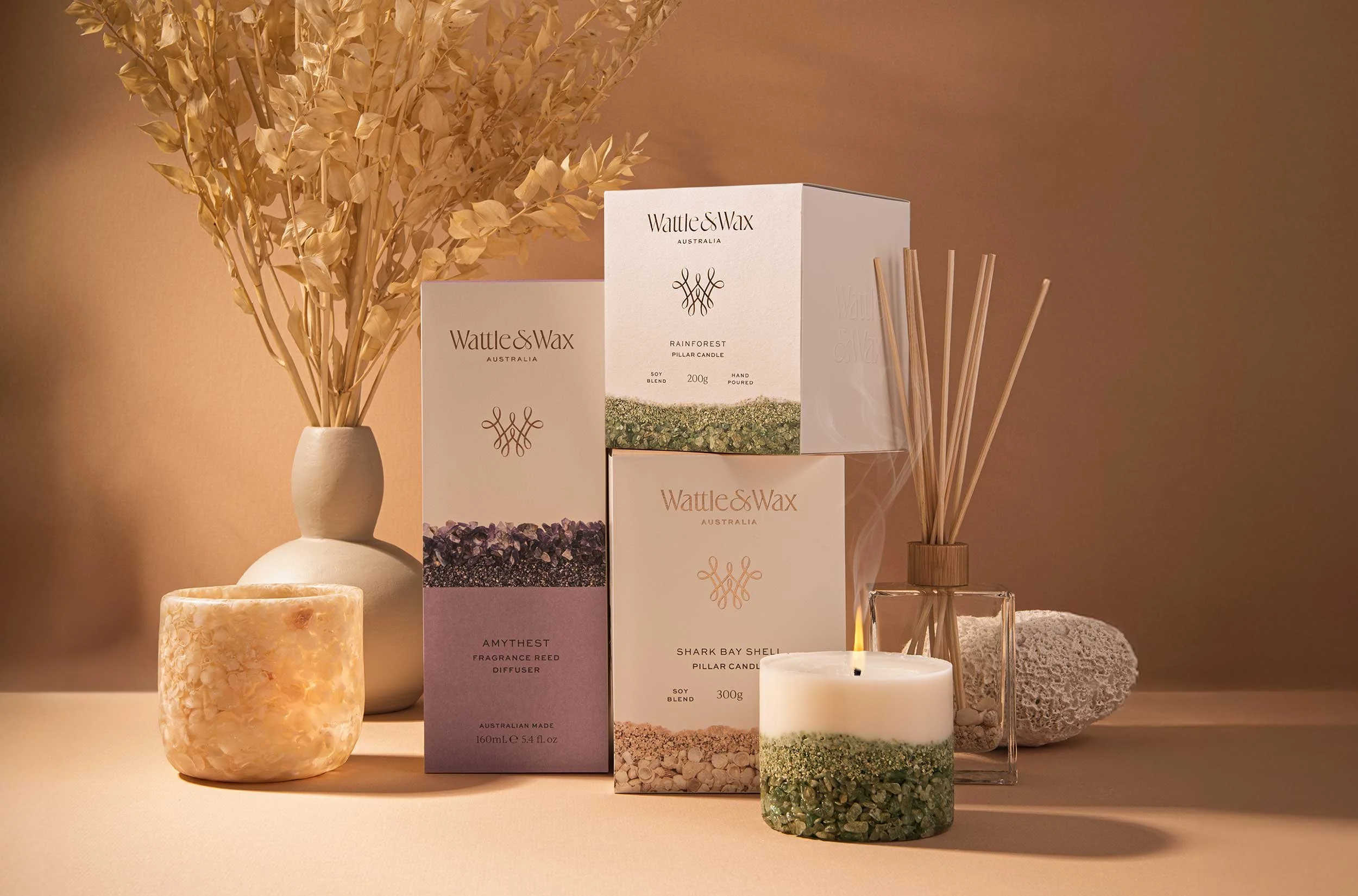
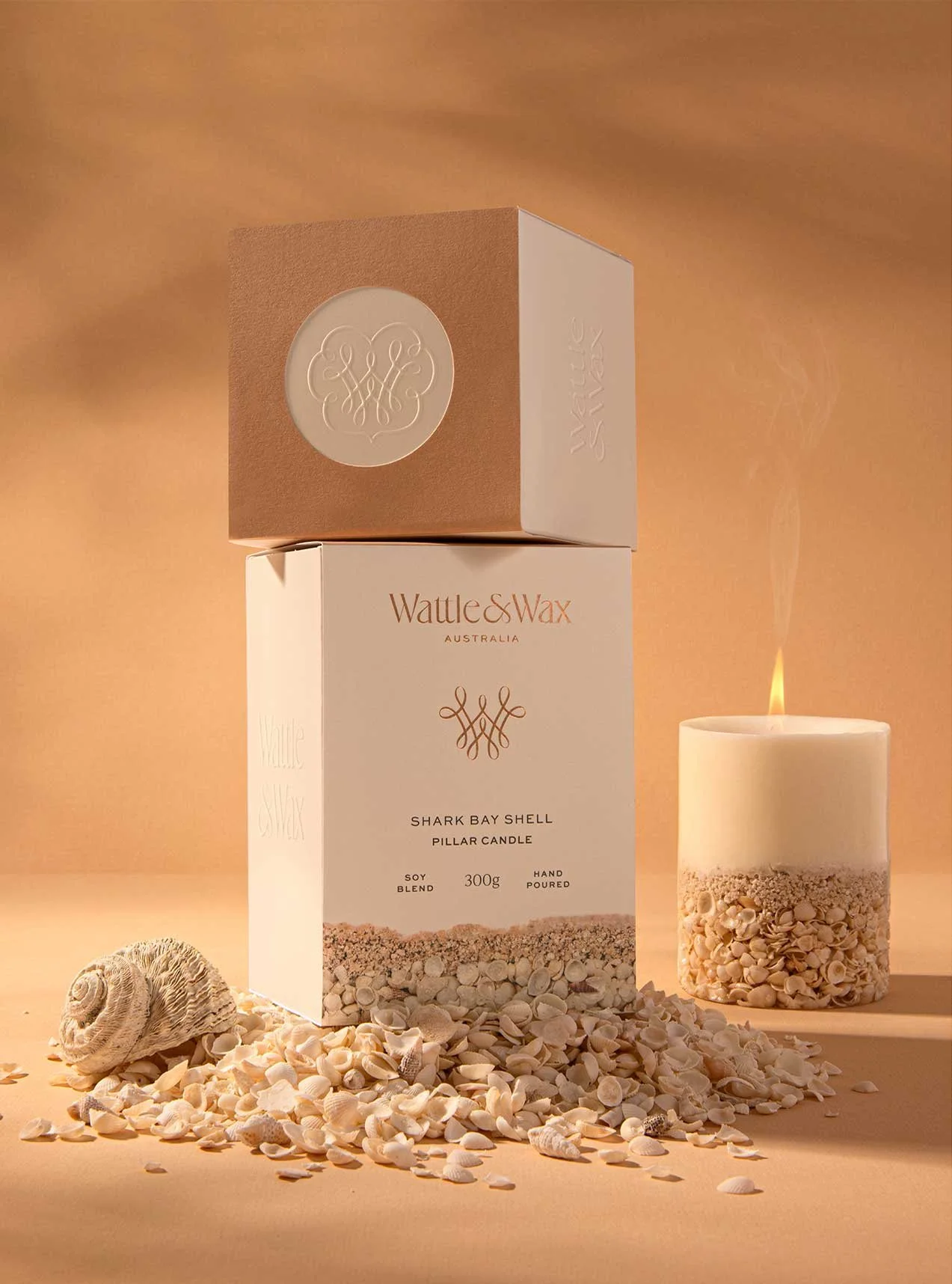
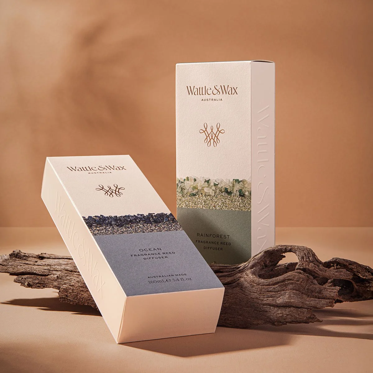
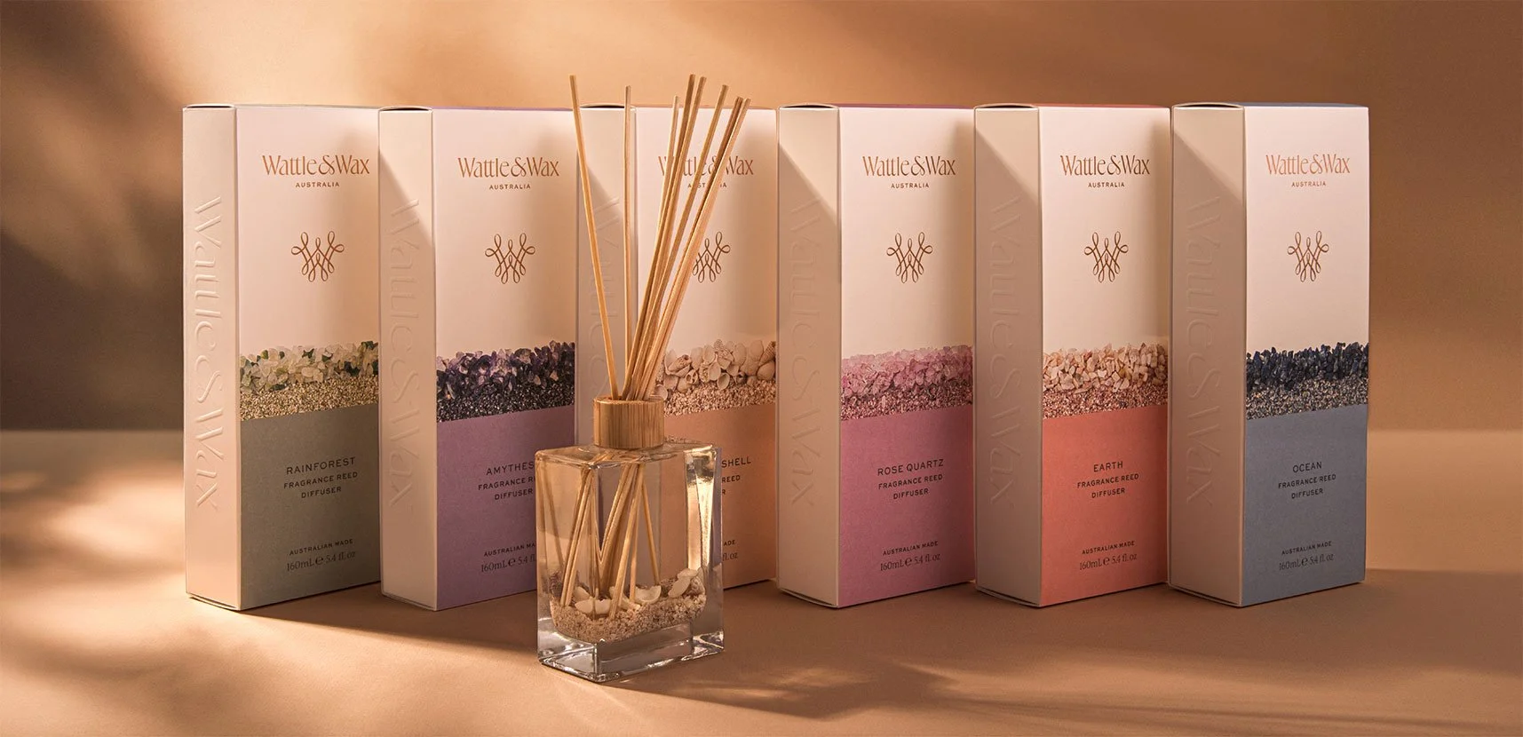
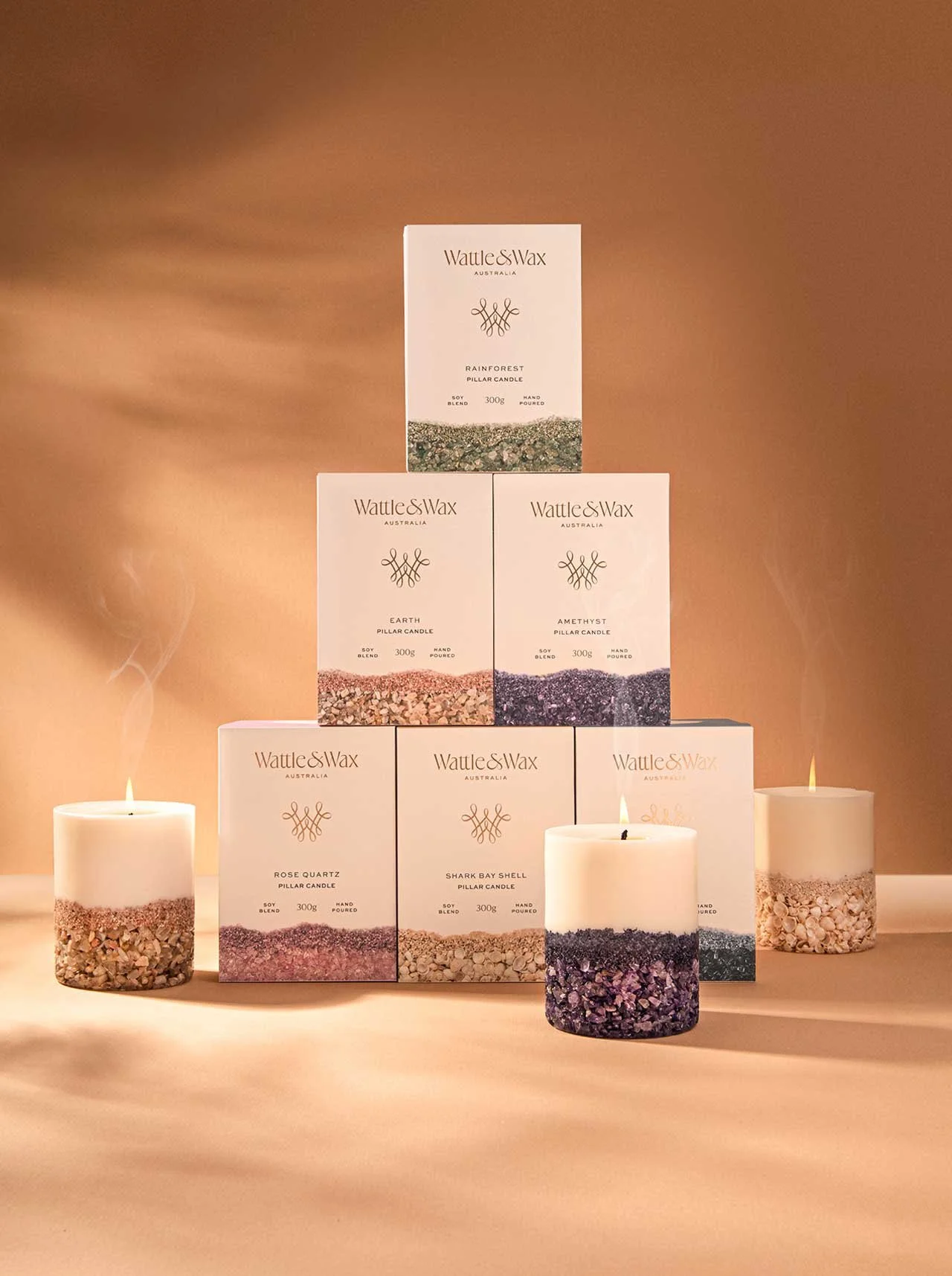
Inspired by nature and the breathtaking beauty of the Australian coastal landscape, Wattle & Wax Australia handcrafts small-batch, unique candles and home decor in their Perth studio. Each piece in their collection incorporates natural materials including sustainably collected shells from Shark Bay in Western Australia, the raw beauty of natural crystals and hand-dyed coral sand, paired with luxury fragrances and scents.
Having newly acquired Wattle & Wax, owner Renelle, was looking for a packaging design for the natural reed diffuser range. The project soon evolved into a full brand refresh, positioning Wattle & Wax as a contemporary and timeless brand that reflects the quality, craftsmanship, purity and sophistication of their product offering.
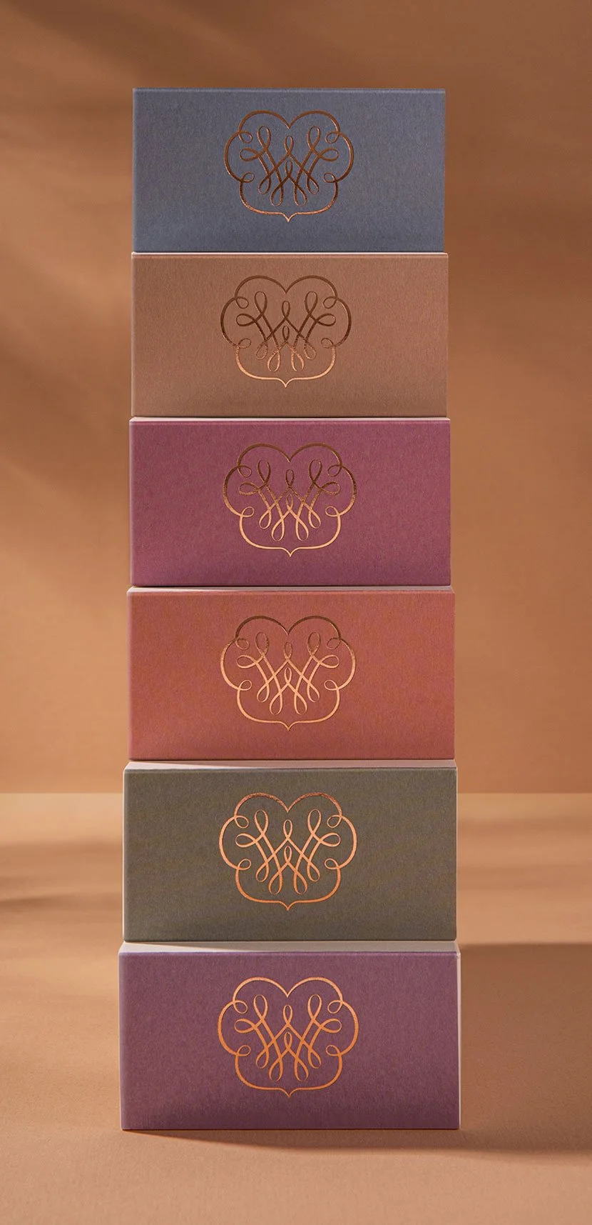
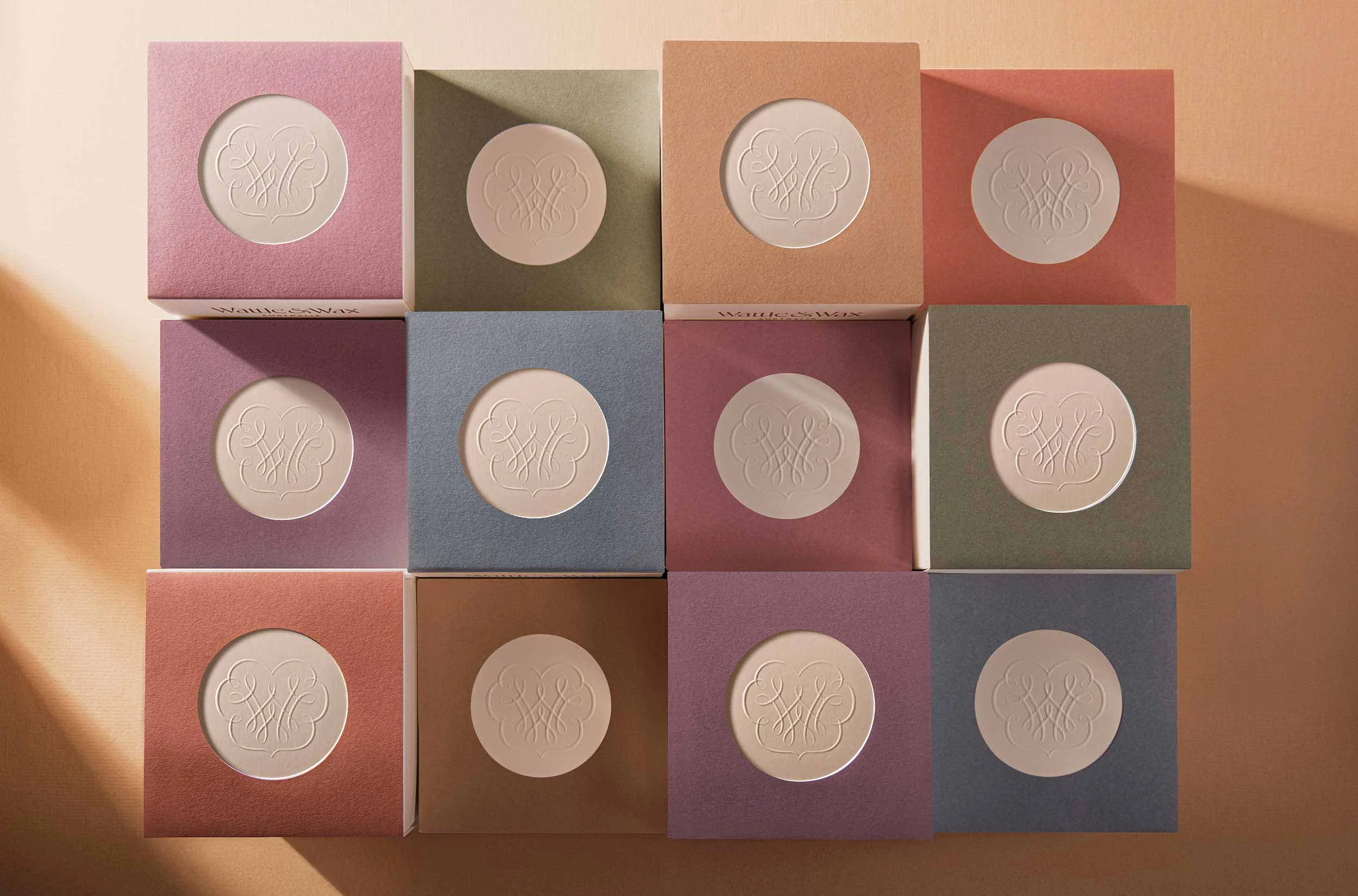
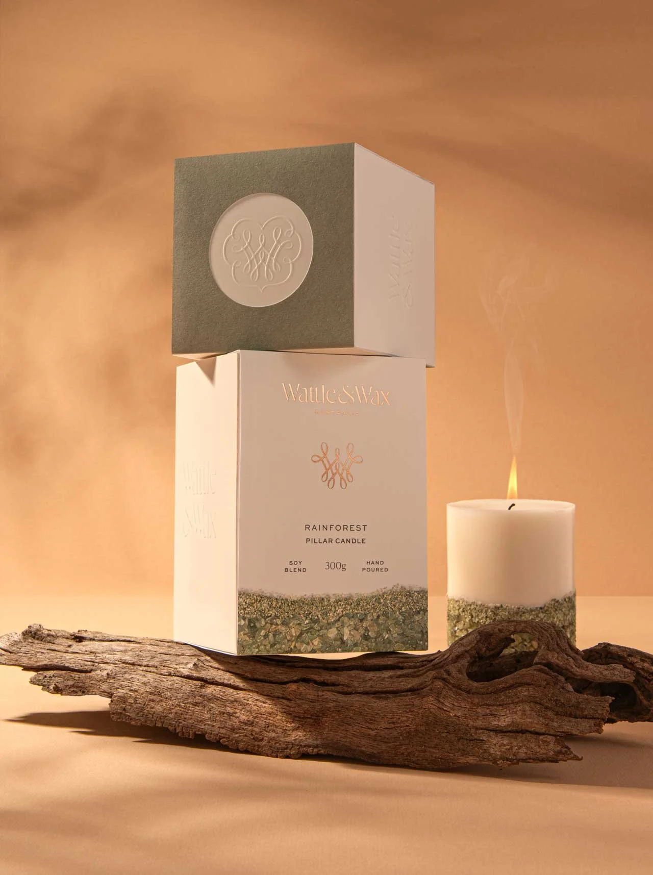
A new logotype, monogram and a suite of secondary brand assets established a refined visual identity. Central to the packaging was a two part structural design solution, a custom embossed base box with interchangeable printed sleeves. This approach provided flexibility for fragrance SKU variants and cost effectiveness in production, while maintaining a consistent look and feel across the range.
Completely enclosed, the new packaging removes the need for plastic windows, protecting the candles from light exposure, while ensuring durability for shipping and retail display.
Metallic foiling highlights the Wattle & Wax logotype, catching the light and adding a subtle tactile sense. Feature photography of each candle on the front panel helps to accentuate the natural textures and materials used to create the products and offers immediate visual recognition.
Beyond the packaging’s aesthetic appeal, the new design also helped to simplify and streamline operations. Balancing functionality with refinement, the boxes are delivered flat-packed for efficiency, are quick to assemble and reduce storage requirements, an essential improvement for small-batch production.
Custom product photography completed the rebrand. The new imagery capturing each piece artistically and celebrating its connection to nature. Through thoughtful design and attention to detail, Wattle & Wax is ready to expand nationally.
Read the client interview with the owner of Wattle & Wax on our blog