
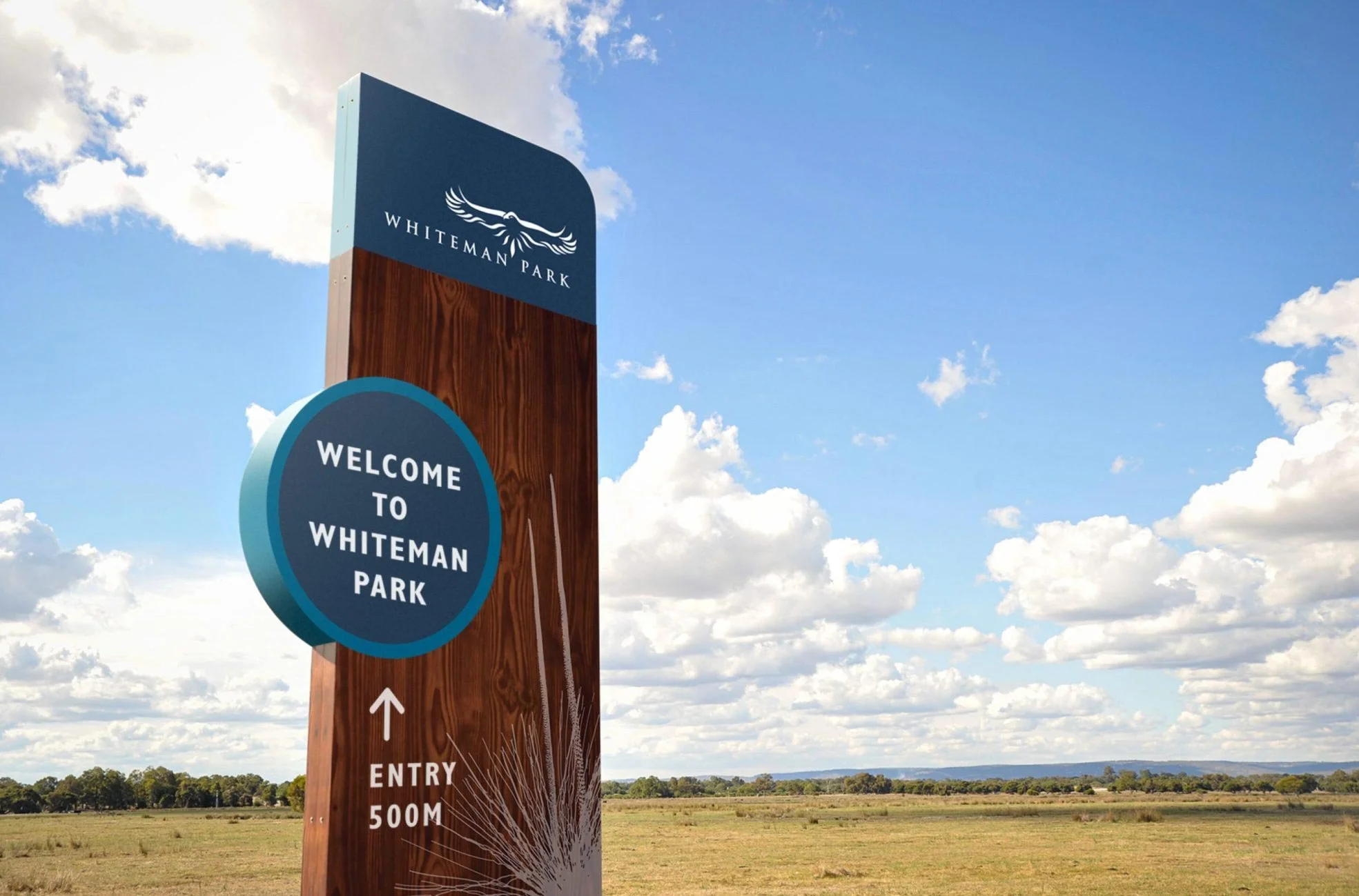
Designing a cohesive wayfinding and interpretive signage system, enhancing navigation while reinforcing the park’s environmental and cultural identity.
EXPERTISE
Wayfinding Signage

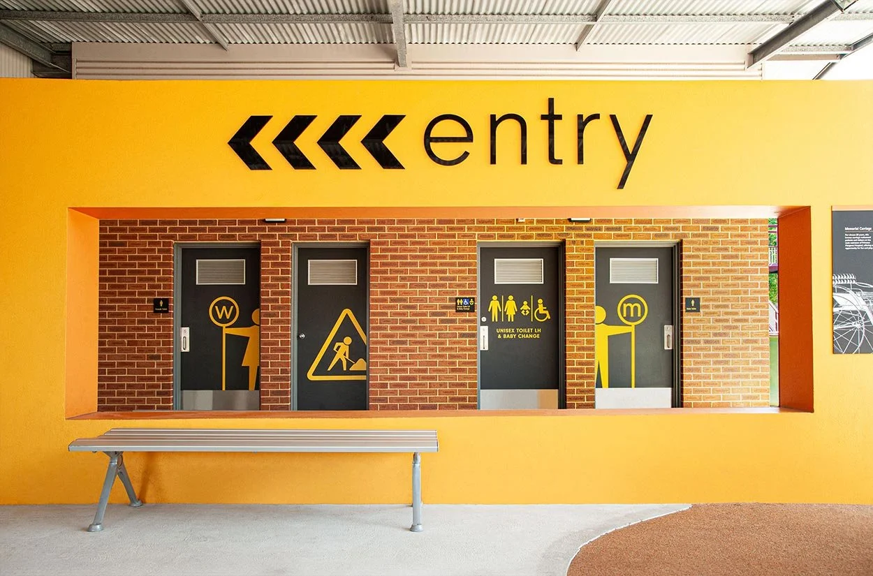
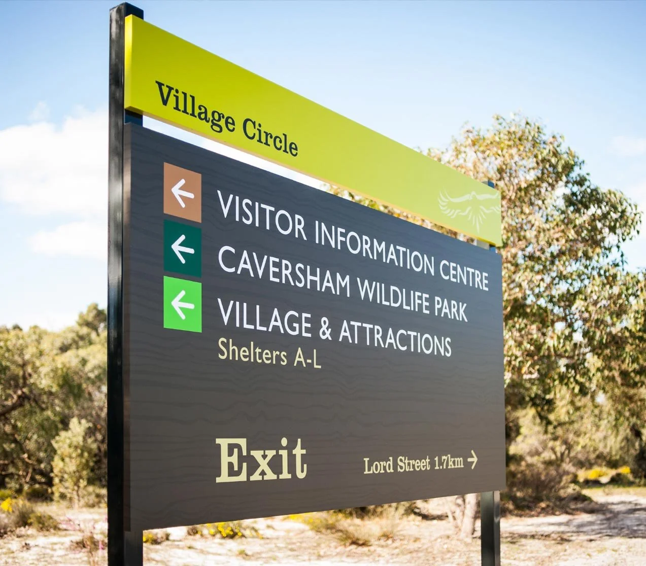
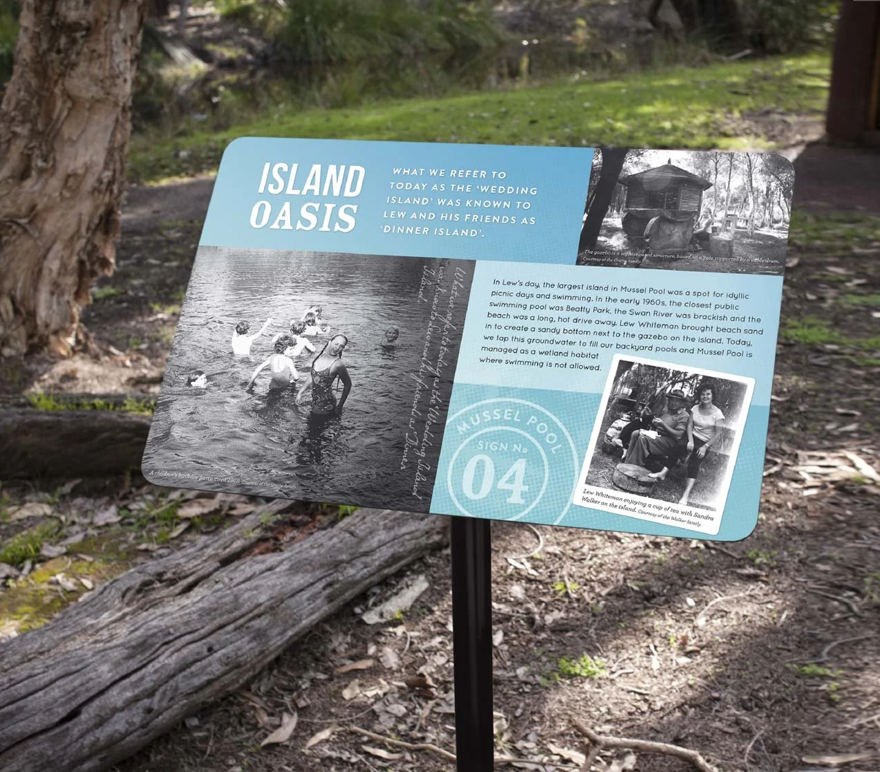
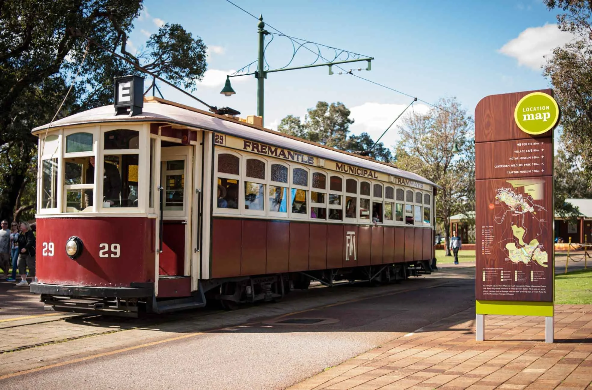
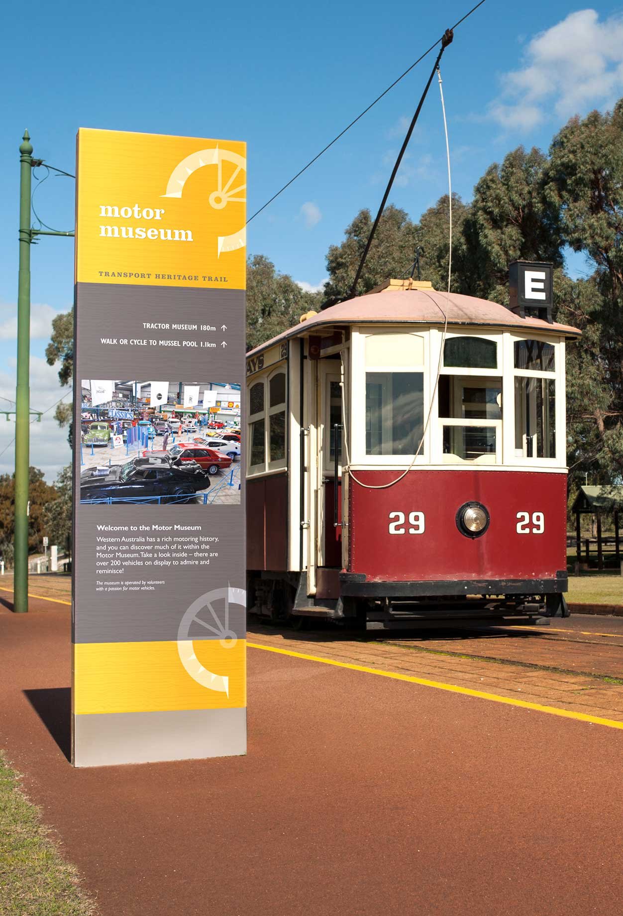
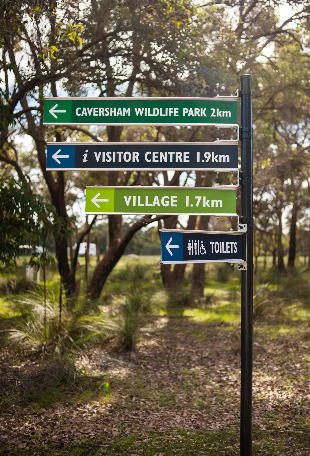
Whiteman Park, in Perth’s northern suburbs is dedicated to the education and conservation of environmental, transport and cultural heritage. Covering some 3,700 hectares of natural bushland, the park offers visitors the opportunity to explore and discover one of Western Australia's most significant recreational and conservation reserves.
As one of the largest metropolitan parks in the world, Whiteman Park is a major tourist destination, welcoming thousands of local, interstate and overseas visitors each year. Following a comprehensive signage audit, park authorities recognised the need for a clearer and more intuitive signage system to help visitors navigate the park and make full use of its facilities and attractions.
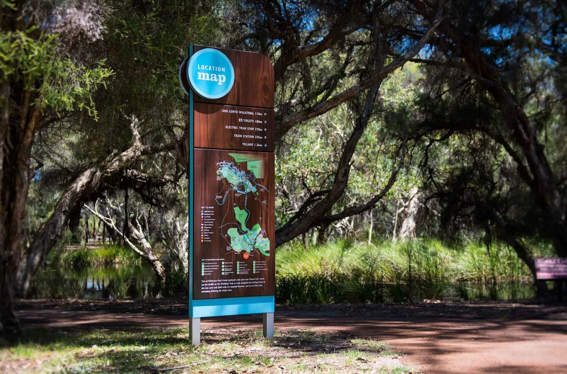
Working closely with the park, directional, wayfinding and interpretative signage was developed to compliment the natural landscape and provide clarity, while also establishing a strong sense of place.
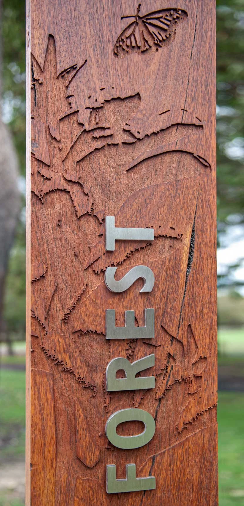
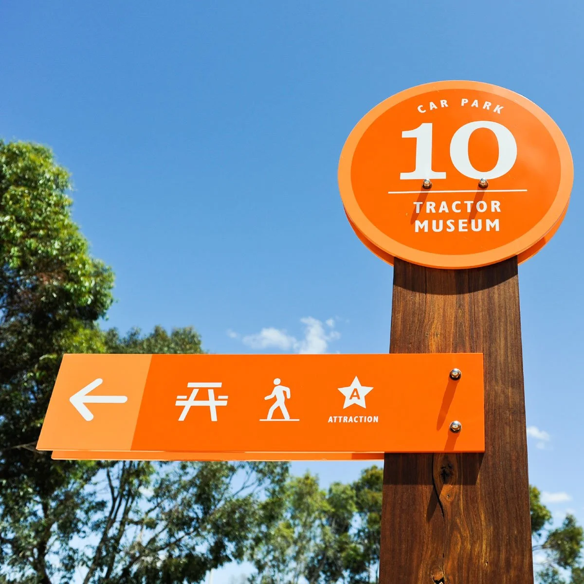
With more than 20 areas assigned to car parks, a colour coded car park system was introduced across the park's four main areas. Based on their key attractions and their east/west coordinates, a series of numbered sign posts were combined with Jarrah timber structures and feature distinctive coloured lollipop tops to create memorable reference points. Each timber post was graphically etched with a pictorial reference of the area to act as a visual reminder, further reinforcing the identity of each location while also blending harmoniously with the surrounding bushland.
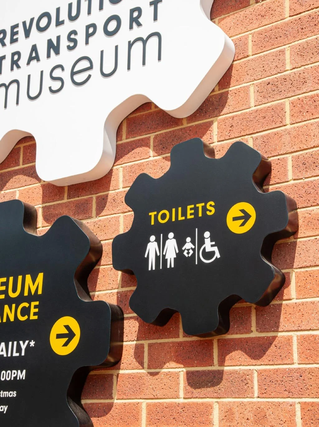
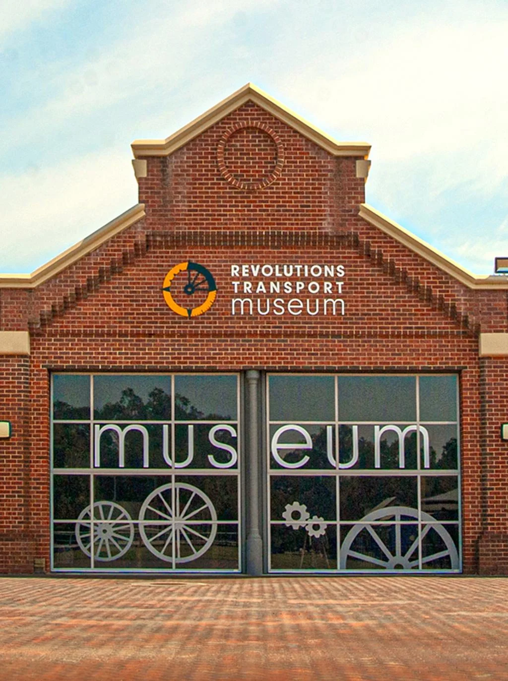
Interpretive signage for specific areas of the park, including walking trails, the Children's Forest and the transport heritage precincts, encourages visitors to engage with the park's rich environmental, cultural and historical stories. Wayfinding and interpretative signage was also applied to the Revolutions Transport Museum, including large scale window graphics, to help improve visibility and create a more welcoming arrival experience.
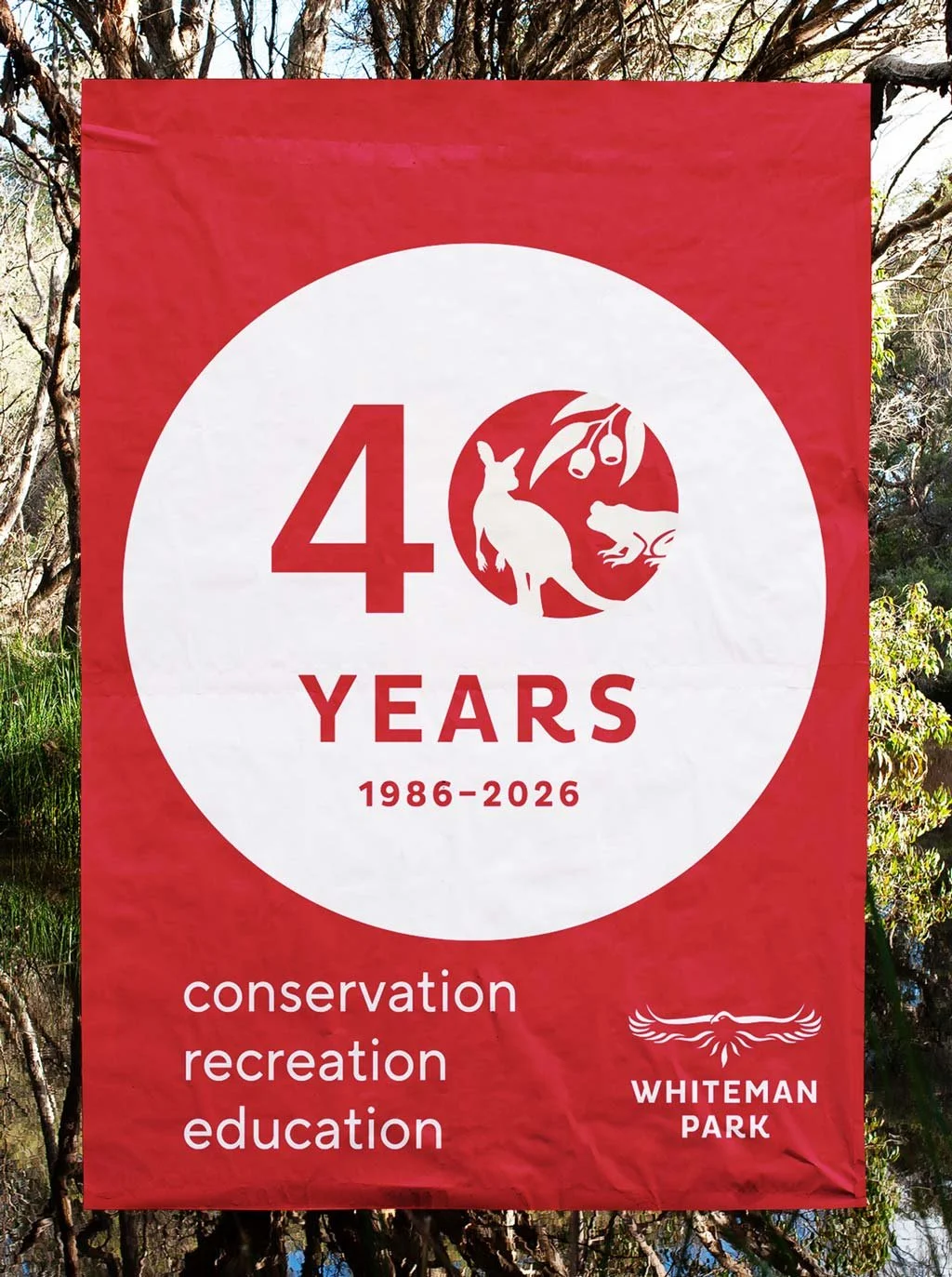
Celebrating 40 years of conservation, recreation and education in 2026, Whiteman Park also commissioned us to create the park's 40th anniversary brand identity. The commemorative mark features flora and fauna illustrations of a wallaby, eucalypt leaves and gum nuts and a Motorbike Frog, representing the mammals, flora and amphibian life that make Whiteman Park's natural environment so unique and diverse.
Designed as a flexible identity system, a suite of secondary anniversary marks introduced interchangeable native icons to expand the visual language across different programs, activities and applications, while symbolising the diversity of the landscape and the living environment the park has protected for generations.
A ruby red colour palette was deliberately chosen, as it is traditionally associated with a 40 year anniversary, to provide a strong celebratory cue. It sits confidently alongside the established Whiteman Park brand identity, together creating a distinctive visual identity that honours the park's enduring commitment to conservation while looking confidently towards the future.