
CATEGORIES: Packaging. Photography.
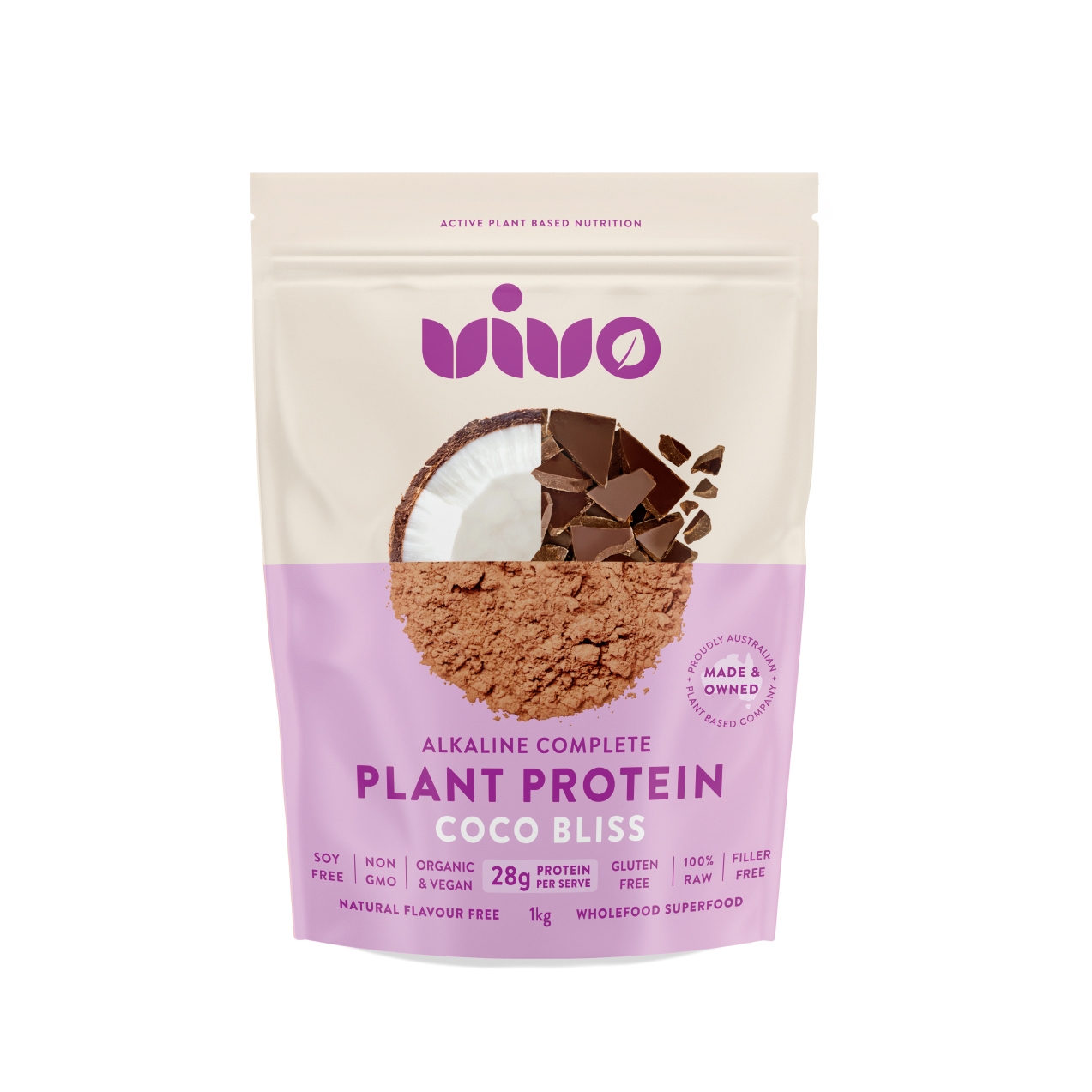
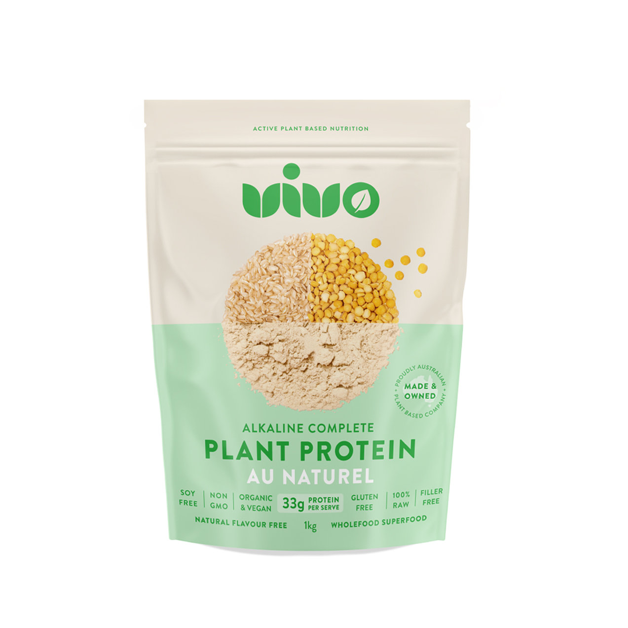
VIVO Nue is a protein company with a difference. Using only high quality, real wholefoods in all their products, VIVO Nue are transparent with their ingredients and food labels, setting an exemplary standard across their industry. Their redesigned packaging illustrates this as well as their unique and underlying core value – ‘Because less is more’.
With an uncomplicated approach, VIVO Nue’s premium plant proteins are geared for high performance, whilst meeting the needs of people with food sensitives and intolerances. We refreshed VIVO Nue’s logo, to maintain their already established brand equity and personify the connection with the plant based protein powder’s REAL, natural ingredients.
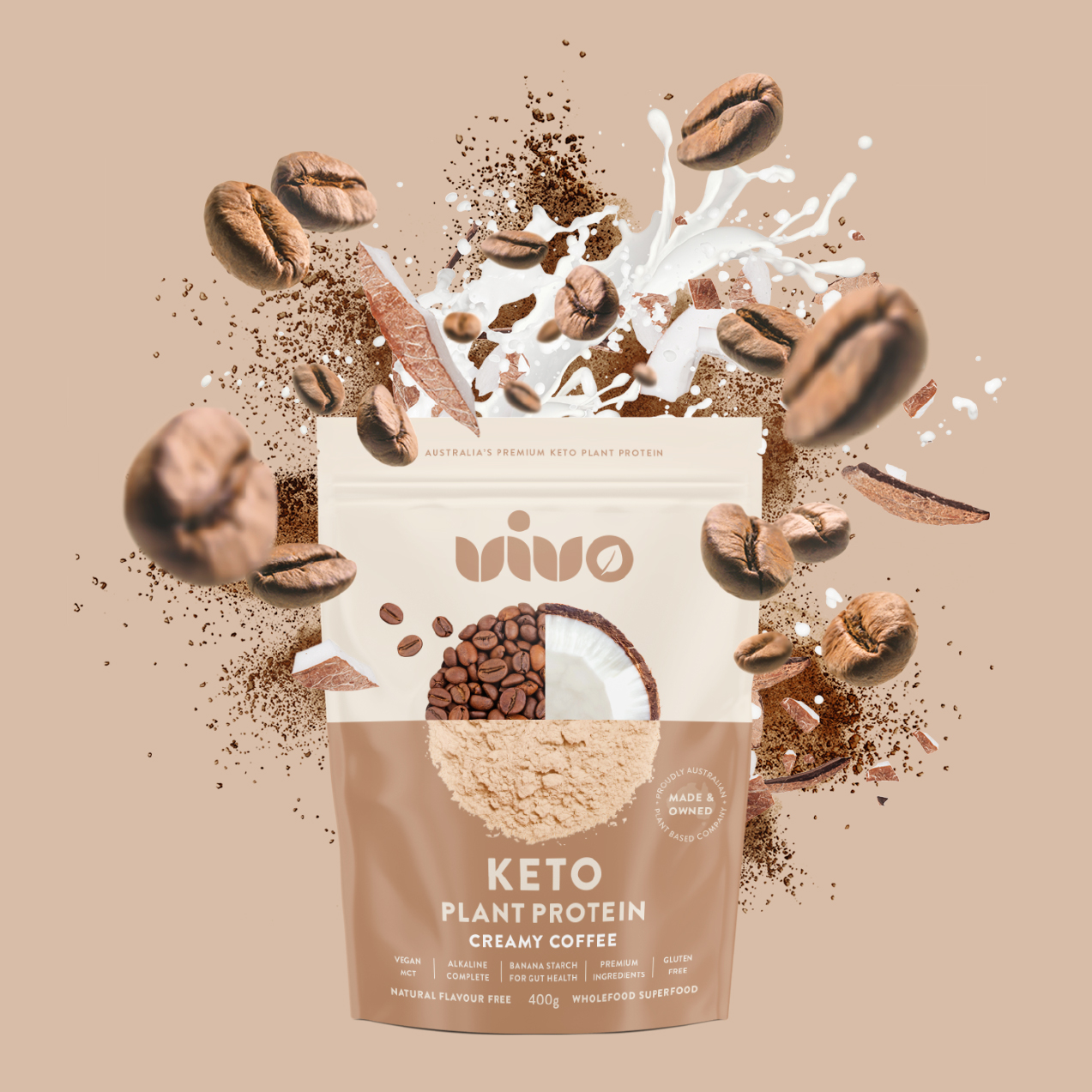
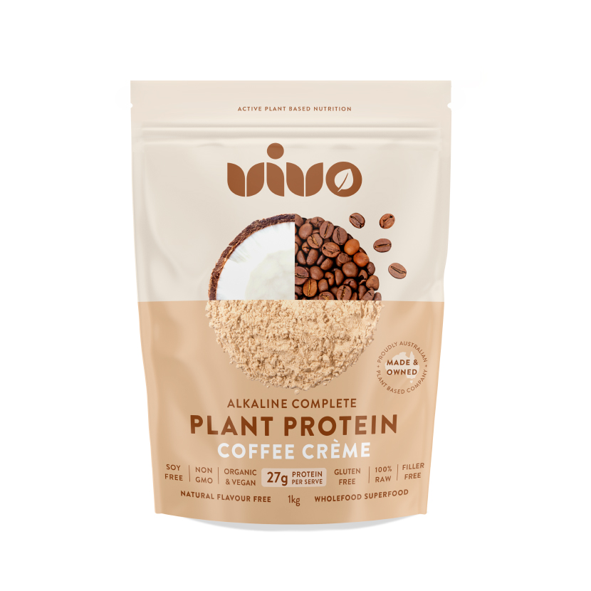
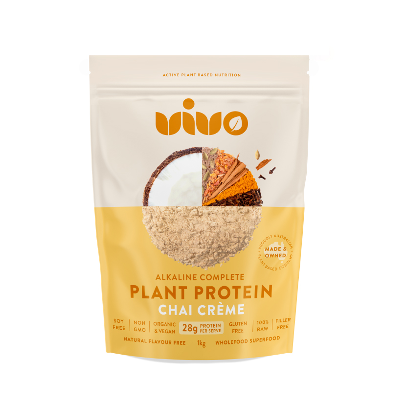
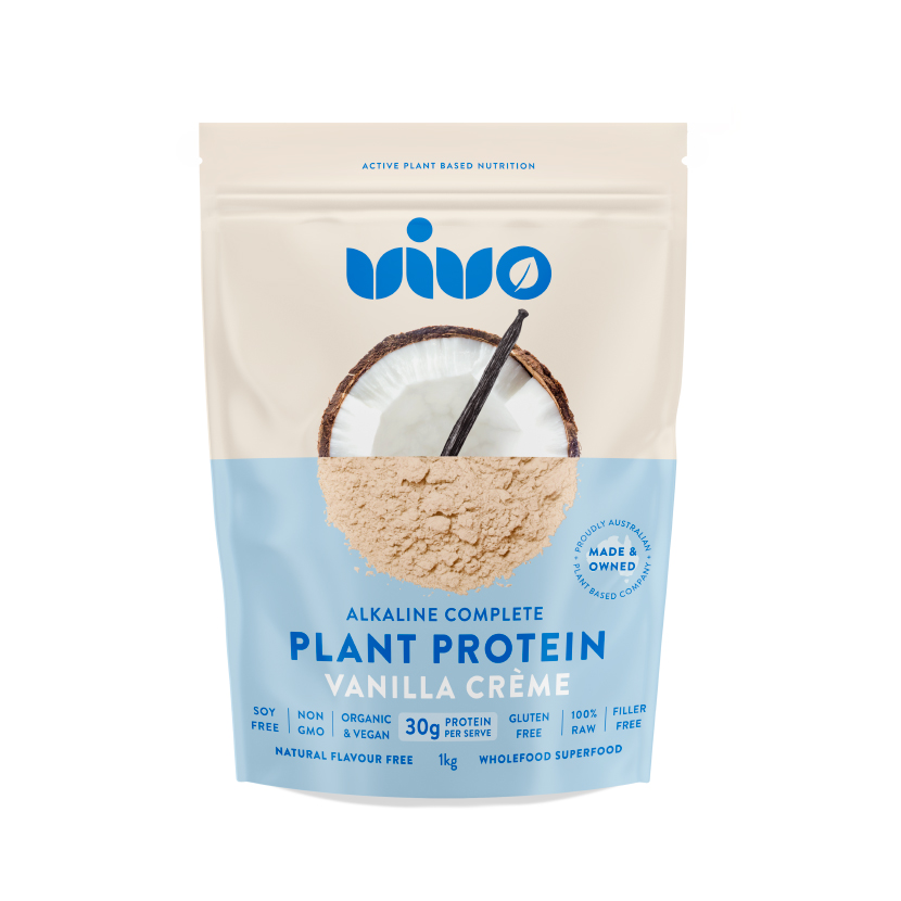
We developed a complimentary colour palette for each protein variant and intentionally used images of the wholefood ingredients on the front of the packaging. This enables consumers to quickly identify VIVO Nue’s real, pure, natural and premium ingredients.
“Tracy and Geoff are true pioneers and visionaries in the branding and packaging space. In my 9 years of experience in this industry the“norm” is always underdelivered. Tracy and the team at Dessein are the 1% exception that truly listens to understand and have over delivered every time. Thank you Tracy, Geoff and the Dessein team in bringing the new era of VIVO to life from thoughts to reality. I look forward to our continued work into the future,” Salman Nouri, VIVO Nue.


