
CATEGORIES: Branding. Packaging.
AWARDS: Commended Mark Winner, World Brand Design Society 2022
Silver Pentawards 2023
Silver Graphis Design Annual 2024
EFM sees things differently. Designing and manufacturing an extensive range of high-quality device gear, they offer revolutionary phone cases and accessories to ignite the senses.
Their Australian designs provide a user experience engaging people through touch, sight, sound, taste and the latest EFM innovation – scent.
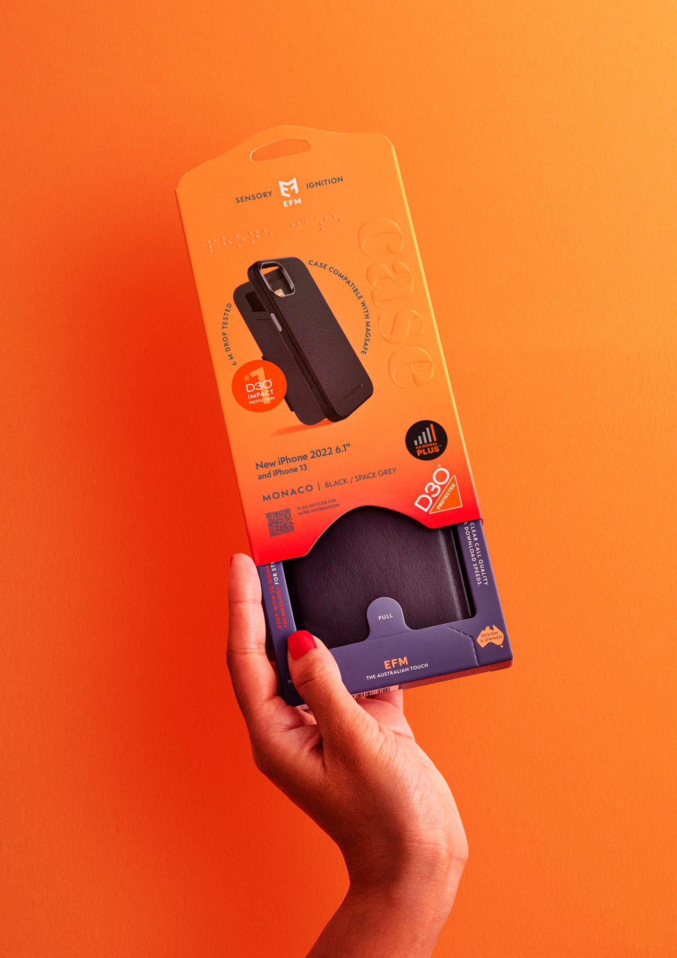
It is this multi-sensory experience that EFM has brought to the forefront of their brand, which we have encapsulated into their packaging. Incorporating visual ques, auditory features, tactile experiences, olfactory elements and the taste sensation by recognising the consumer has ‘good taste’ purchasing a premium product offering guaranteed protection.
Using recyclable, bio-degradable and sustainable materials, including soy inks and FSC (Forest Stewardship Council) card, we removed all previous plastics and provided a unique packaging solution to showcase their products.
Ensuring the structural packaging not only reduces material wastage by 12% on average, the innovative design makes the product lighter to ship, protects the products from dust and is also secure and tamper proof.
With the inclusion of an internal mechanism, which clicks when the tray locks into place when pulled down; the friction of the internal moving parts release a subtle but noticeable scent. Reminiscent of the Australian coast, the scent is a fresh, clean ozonic burst with hints of zesty citrus and eucalyptus notes.
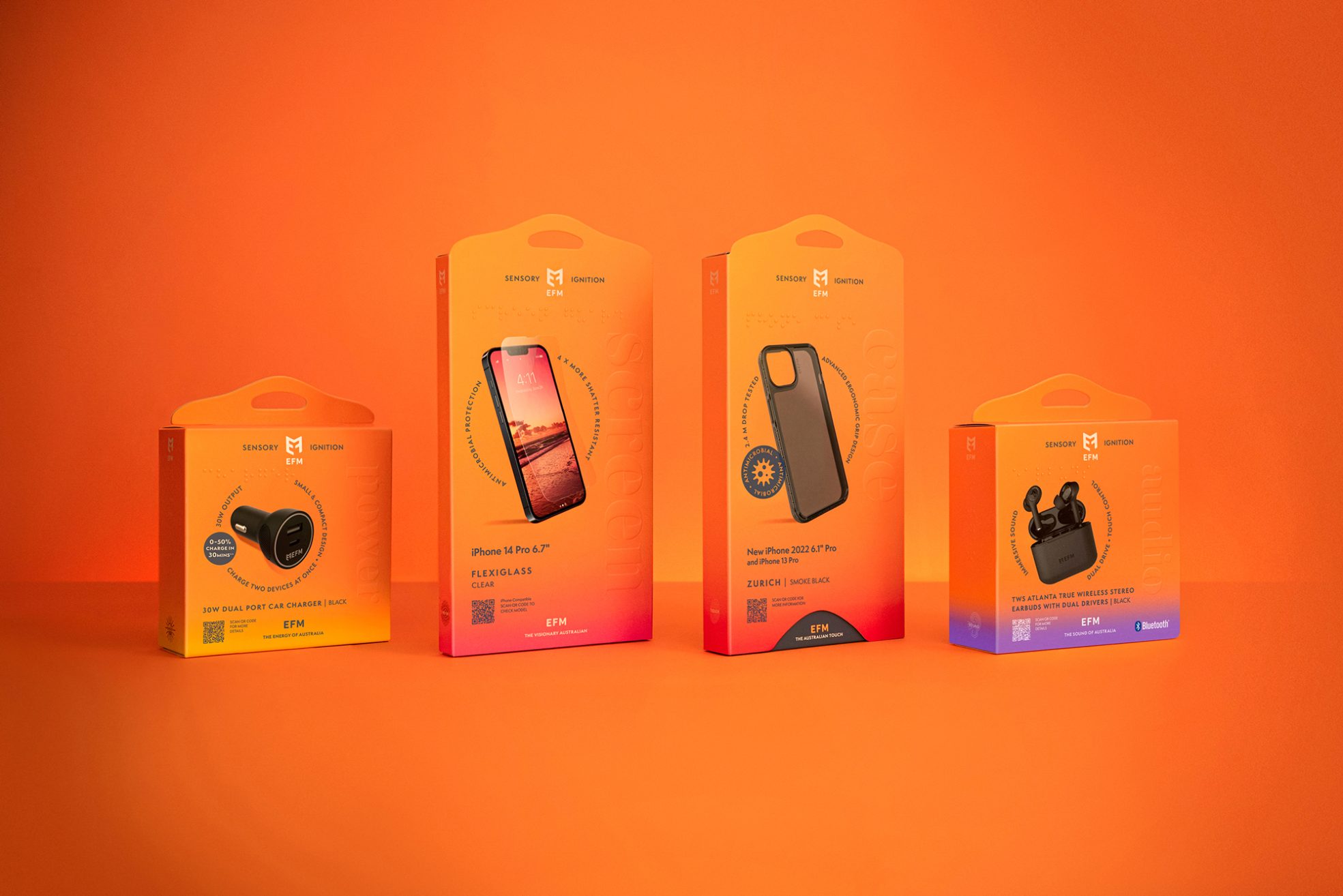
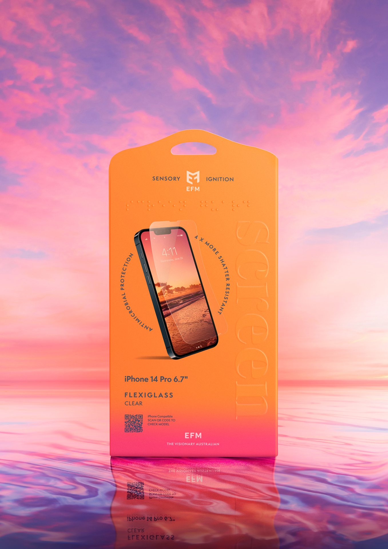
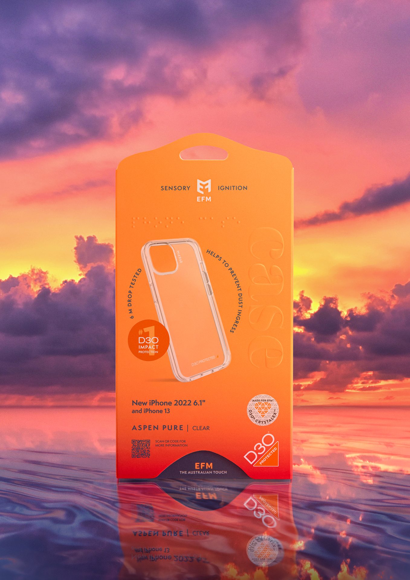
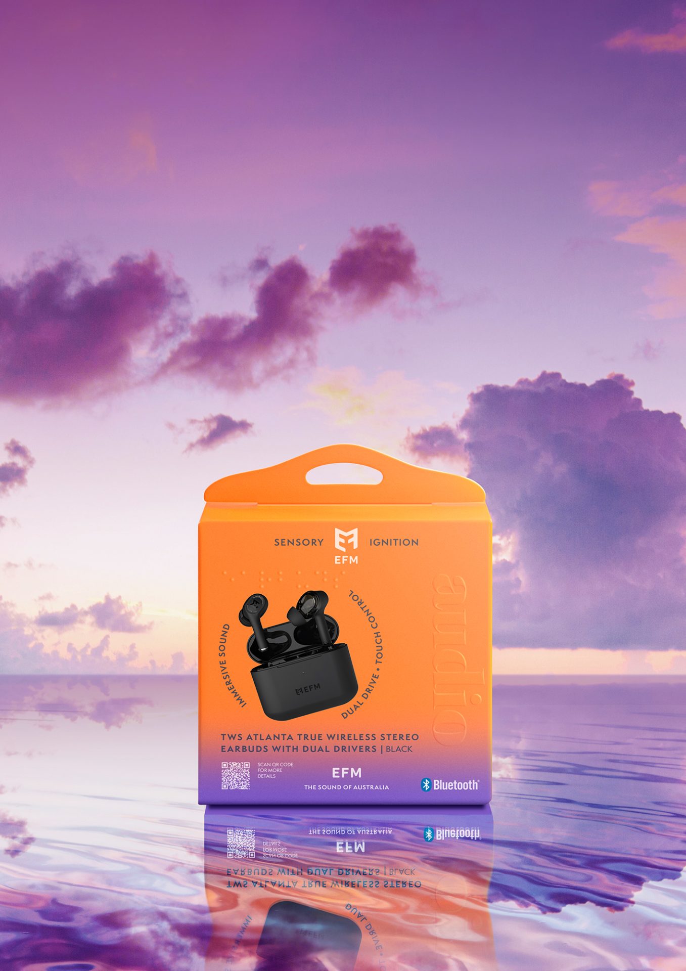
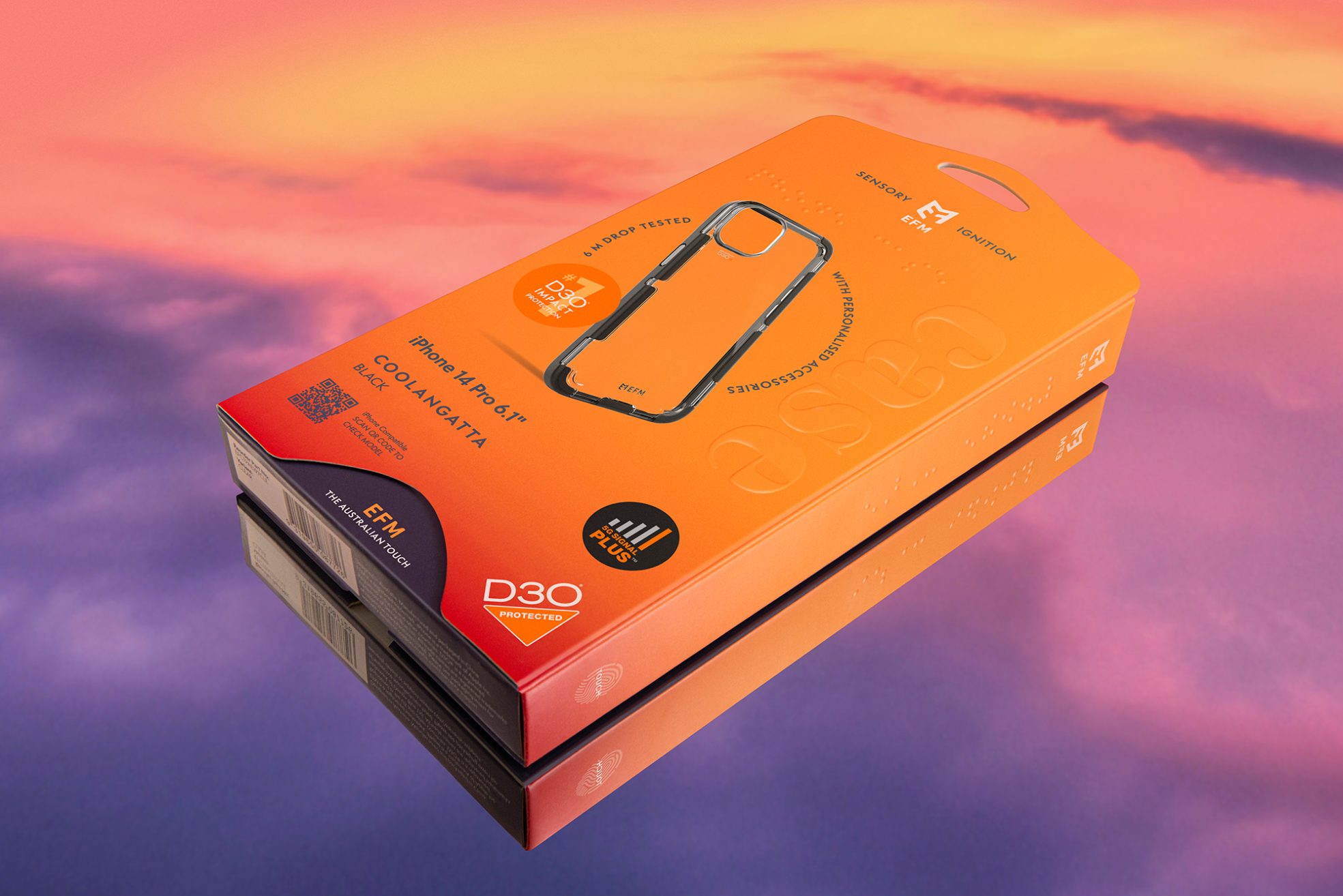
From a visual perspective, we used a signature fluorescent colour palette. Inspired by this Australian company, we played homage to their identify and brought the distinguishable colours of Australian sunsets to the fore. Bright hues of yellow, pink, red and purple were used to identify each product category, a hero image of the product and a QR code to direct consumers to the EFM website enabling consumers to find out more, but also allowed us to remove unnecessary information.
Furthering EFM’s innovative lead, we incorporated Braille text to ensure the packaging is inclusive and accessible for people with a vision impairment and while also further enhancing the tactile experience, with embossed type to differentiate between the product category.
Each product includes an icon on the side panel and on the back of the pack to further distinguish the category.
- The touch icon on the mobile phone case conveys the strong, smooth and textural protection consumers can feel.
- The vision icon refers to the screen protection – armour designed to protect your phone’s screen with crystal clear clarity your eyes can see.
- The ear icon on the audio packaging relates to the perfect sound and audio you can hear.
- The sun icon depicts energy and the warmth you can feel, an extension of EFM’s sensory experience.
- EFM’s power cables and charging accessories to power up devices fast, safe and efficiently.
“Since the inception of EFM® in 2015, we have been proud to partner with Dessein, as the team’s dedication to our brand is evident in all aspects of their work and the resulting product packaging. Dessein approach each project undertaking with great attention to detail, years of industry expertise and a holistic creative approach to bring our newest EFM product packaging to life, from understanding our brief, to concept and development.
Our latest EFM packaging project was no simple task, however Dessein are always forthcoming and approach each challenge in their stride and delivered solutions that are truly innovative, on-brand and a stand-out in market.
“EFM’s latest packaging breathes life into phone accessories shop shelves, with a standout presence versus the competition. The packaging combines minimal use of materials, all of which are 100% recyclable, with optimal use of D3O protection information, ensuring consumers know they’re getting the best for their money.” said D3O, EFM’s exclusive technology partner that engineers the number 1 impact protection material in the world.
Through creative and innovative design, the latest iPhone 14 product packaging has on average a reduction of 12% in materials when compared to the previous iteration. Using less material, makes the product lighter to ship, reduces material waste and is better for the environment. Other elements include utilising water-based inks and the revised packaging uses FSC paper.
Another area of innovation is the incorporation of braille for greater accessibility for the vision impaired. The design was developed with a view of being more inclusive to all Australians with identifiable accessory category statements outlined on both the front and spine of the packaging.
And finally, for a unique unboxing experience capturing EFM’s Australian identity a unique scent has been developed and incorporated into the new Case Armour range packaging.
We highly recommend Tracy, Geoff and the entire team at Dessein for all things packaging and branding, as we have found they are leading industry experts, who take great care and passion in all things EFM®,” Chris Sciortino.


