The importance of branding products for small businesses
AUTHOR Tracy Kenworthy
DATE 3 March 2026
A brand identity example for Margaret River Natural Spring Water
Many of our clients are businesses that began from humble beginnings, small businesses and startups including a cupcake brand born from the love of baking with mothers (Great Temptations); a healthcare worker creating a healthier version of her favourite yoghurt to overcome the negative health effects conventional brands had on her autoimmune-compromised body (CoCoMe); or a natural spring water brand bottled at the source from their small family-owned farm (Margaret River Natural Spring Water).
Each of these businesses started with a strong idea and genuine passion, often building their brands from the ground up. Having turned those ideas into reality, sometimes with limited funds and many weekends spent at the markets selling their wares, they eventually realised that for their products to reach their full potential, they needed to take the next step… product branding.
Not every small business or startup takes the same path when branding products. Some may have played around on Canva, bought a cheap logo, or perhaps used AI to create one. They might have printed simple stickers and popped them on their product to get them started.
It doesn’t take a rocket scientist to figure out these kinds of products are unlikely to grow beyond their local markets. For some, that might be enough, but for those with truly great products, a cheap logo and label are simply not going to cut the mustard.
The good news is that many of these emerging brands have already done a lot of the groundwork. They understand who they are, have identified who are their core customers, recognised their current limitations and can see the opportunities ahead. Some have upscaled their businesses, had basic design work done for a label and turned their product into a very well-received supermarket offering. Yet somehow, they still have not reached their full sales potential. Why? Because what they are missing is branding, the storytelling of who they are, what they offer and why they are different from their competitors.
Branding products and building a brand through storytelling
Storytelling is the invisible connection between product and consumer, a love language which says ‘Yes!' You understand me and know what I need. I feel good about my purchase because I don’t have to think hard or read the fine print to know I’m going to love it’.
Storytelling and the art of connecting clients to your brand through product branding
Dessein’s design philosophy is to create brands of the heart, brands which engage, excite and evoke a personal response. When it comes to branding products and packaging, that is where we excel.
We love a good story that speaks from the heart, tells the truth and delivers on a promise. Our own story is built from these same foundations, and that is why, I believe we have been able to develop product branding for small businesses that have enjoyed real success.
It’s not just about making a pretty logo, or adding a shiny foil to a label, it’s about understanding the fundamentals of the brand and how to express them through the packaging and product branding. A super fine, modern script font may look fantastic on a shop window, but put it on a product smaller than a matchbox and you’re in trouble.
That is why having a brand strategy before creating a successful brand is paramount. It’s an important step, that if bypassed, may result in a confused brand which misses the mark and fails to connect with potential customers.
The process of branding products and packaging design
Following a simple 5-Step Packaging and Product Branding Design Process, we build a framework which defines the brand’s values, identifies its target customers and establishes how to speak to them in the right tone of voice through carefully chosen design cues.
Dessein’s 5-Step Packaging Design Process
Step 1. Discovery & Briefing
Step 2. Insight & Strategy
Step 3. Concept & Creative Direction
Step 4. Design Development
Step 5. Implementation & Launch Support
It’s a process we employed for Margaret River Natural Spring Water (MRNSW) when we developed their product branding. Below are some of the key packaging and branding considerations we undertook.
Brand identity example, a case study about Margaret River Natural Spring Water
While this client had extensive knowledge with the bottled water category, major competitors and where MRNSW was positioned in the marketplace, we provided a broader snapshot of the market segment to compare with his own research.
We modelled a Brand Blueprint, which captured the brand essence, positioning, vision, values and attributes. His response:
Brand Blueprint: Yes, this is where you really shine. In all my years and dealings with marketing people and the like, no one has simplified and distilled the essence of who we are like this. Definitely not me - I’m too confused and too close to it. It’s a good document… I’ll need to infuse those words into everything we put out there.
SERGE CONTI | MARGARET RIVER NATURAL SPRING WATER
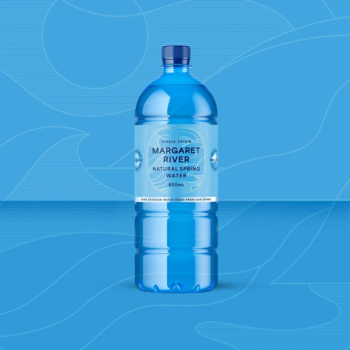
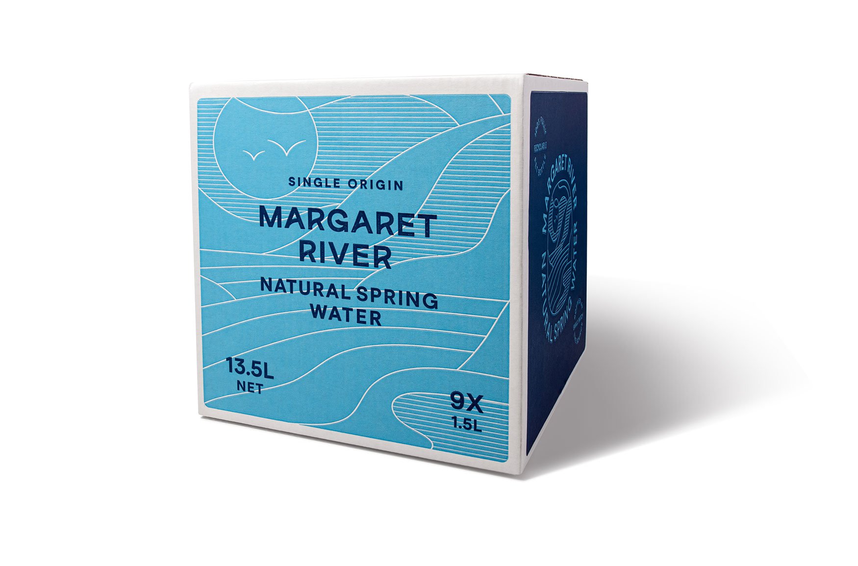
Turning the brand strategy and product branding into a reality for MRSNW included a custom logo design, colour palette and typography depicting the brands’ iconic location and lifestyle values.
But creating a brand was not enough. It had to work first and foremost as a label, compatible with existing label specification and application machinery and suited to the existing recyclable bottles.
Branding products and bringing Margaret River Natural Spring Water’s brand to life through label design.
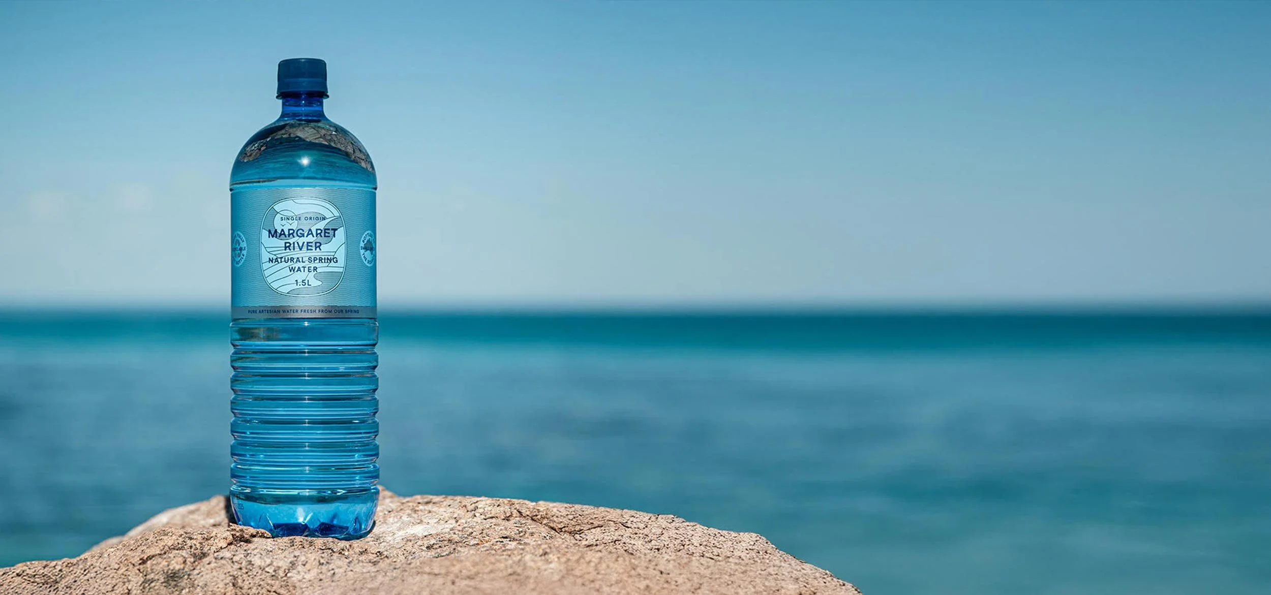
The retail environment is usually the first place your customers experience your brand face to face. For MRNSW, that is the water bottle label.
After reviewing competitors and considering print economies using only a few colours, Dessein created a label using metallic label stock as a key part of the design. The subtly contoured surface of the bottle worked perfectly with the silver foil label stock, reflecting and bouncing light from different angles, just like the pristine waters of the brand’s namesake location.
The foil effect itself also positioning the brand as a premium offering against its higher priced competitors.
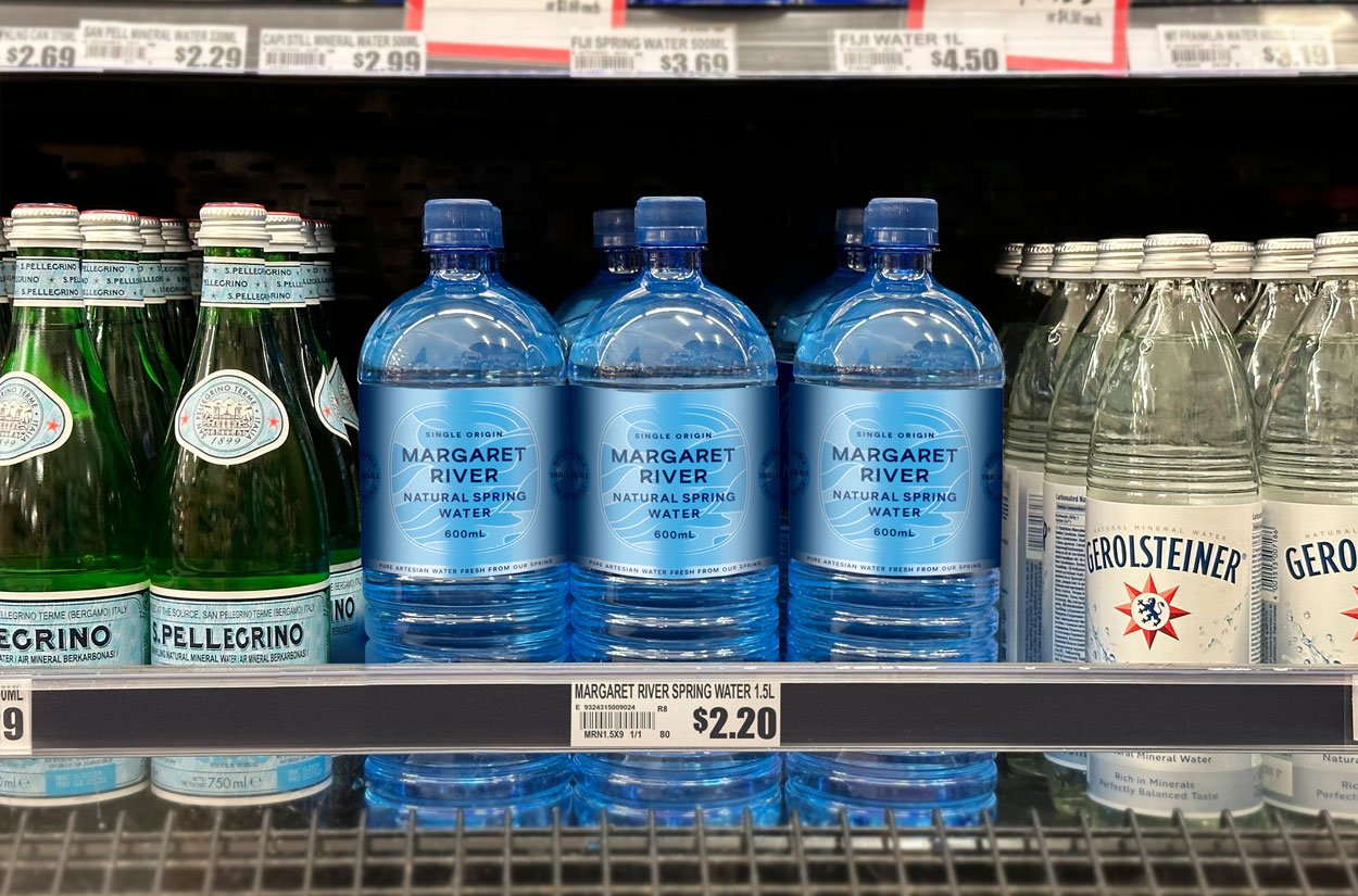
Testing the product branding in store
Having already investigated numerous locations where MRNSW is sold, an important step was to test the new designs on shelf next to their competitors.
Conveying the brand’s values and attributes with clear, honest messaging and a label design capturing the essence of the MRNSW brand was essential. To ensure these cues were effective, we took the new brand into the supermarket environment. Seeing it in store confirmed for the client this was the direction for his branding.
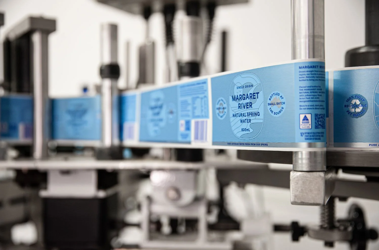
Preparing the labels for print
With a few minor working adjustments and client approval, we turned our attention to final print preparation.
Printing on a foil stock requires white ink underneath any colour (in this case, light and dark blue) that should not appear metallic. It can be a bit tricky, as anything you want to appear in the foil beneath needs to be ‘knocked out’ of the white layer. It’s always best to print separations and layer them to ensure accuracy, which is exactly what we did.
Printing onto shipping cartons
In addition to the labels, the next major consideration for the MRNSW brand was the shipper carton for both bottle sizes. New artwork was created, as the printing process, known as flexographic printing, is quite different and comes with its own artwork requirements.
Key considerations:
Limited PMS colours: Carton printers such as Visy, do not stock every PMS colour, which can be a challenge for designers.
Flexographic limitations: Colours that touch can overlap, creating unattractive results. Where possible, avoid this.
Tints and shading: Light-colour tints are not achievable; instead a stipple pattern (dots) is used to create shading. Results vary depending on design and preference.
As our MRNSW design included fine linework in light blue, we modified some lines to white to more closely match the label design.
With the completion of these refinements, the branding and packaging were almost complete.
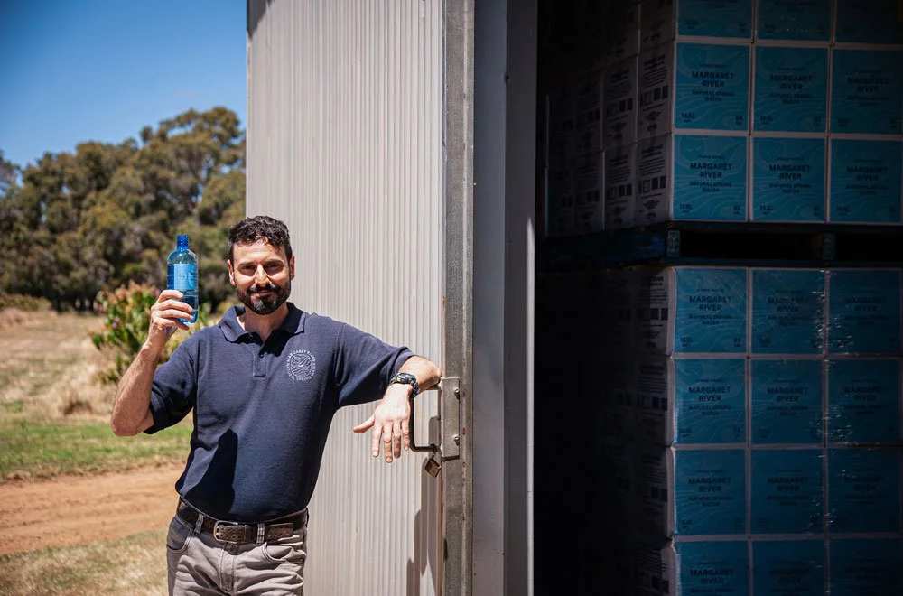
While the website was being updated, Dessein finalised the branding with bespoke photography of the Margaret River Natural Spring Water in its beautiful habitat. Right at home in Margaret River, the MRSNW story is now told.
Author: Tracy Kenworthy
Tracy Kenworthy, partner to Geoff Bickford in both life and work via Dessein a boutique design studio in Northbridge, Perth is a Graphic Designer, who loves intelligent design solutions and concepts that deliver the wow factor and admires those who have the ability to create them.
“It amazes me that these creations can come from the most unlikely of sources and pleases me when I discover them,” says Tracy. “I love it when my family share life's discoveries together and marvel at the world we live in. I try to remain positive through all of life's ups and downs and remember that the journey of our life is of our own choosing. What we get out of it is only as good as what we put into it and the values and morals by which we live.”
Feel free to connect with Tracy on LinkedIn.
Drop me a line tracy@dessein.com.au or call +61 8 9228 0661
Like to talk to us about your product branding needs?