What Lies Beneath
The underlying layers of Black Swan’s 2013 Poster series and how it took out the Best in Show at the Creativity International 43rd Print and Packaging Awards.
Receiving Best in Show for any design work is a privilege and an honour that every design studio usually only dreams of attaining… so you can only imagine our pure delight and excitement when we found out Dessein had achieved just this! One of the judges commented:
“It is smart and well executed. A beautiful balance of colour and monotone, of imagery and use of white space, of photo realistic imagery and photo montage, and the great level of detail work and consistency throughout each piece make this a memorable entry.”
The series of posters for Black Swan State Theatre Company were used to launch the 2013 season and in this blog we reveal how the design was built.
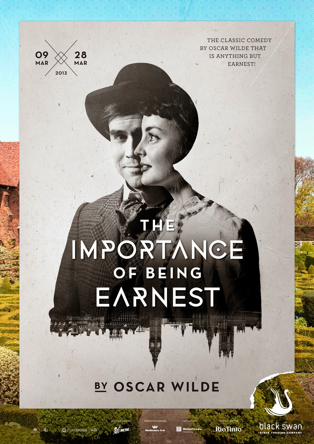


 The Black Swan State Theatre Company poster series for the 2013 season launch. |
Working for any arts-based organisation can be both challenging and rewarding at the same time. The mix and variety of creative minds and visions working together can differ with each perspective of that vision.
Compromises are made in an effort to please all parties – usually resulting in a design which falls short of each expectation, resulting in a solution which looks like every other design. This has not been the case with the Black Swan State Theatre Company (BSSTC), the proof of which lies in the success of the 2013 program.
Dessein has a truly unique client-designer relationship with Black Swan. A relationship that has developed over more than 7 years – each year pushing the design boundaries to reflect the new season with playful imagery styled and crafted into a signature series defining the Black Swan season ahead.
The advantages of working with a client over many years are numerous. The biggest of course, is the trust developed with each new success. Trust is immeasurable, for without this, doubt lingers and festers into unfounded worry. The ultimate trust is when a client can explain their vision and objectives and then say no more – passing their creative power to another. Surely there can be no greater trust.
Creating your own brief, developing concepts and exploring different ideas that celebrate the power and passion behind all the creative collaborations, (the writers, directors and marketers) is a privilege not to be misused. It is every design studio’s dream; one Dessein respects and embraces whole-heartedly.
The six principal productions for BSSTC’s 2013 season celebrated a fun-filled selection of some of their favourite writers of the last 100 years, teaming them with award-winning directors and much loved performers to present a series of playful stories which embrace ingeniously written dialogue.
While each play is an individual entity waiting to be discovered, the collective suite’s common denominators – the characters, the emotions, the time periods and the settings are brought to life through three layers of imagery…. creating the ‘What lies beneath’ theme.
“What lies behind us and what lies before us are tiny matters compared to what lies within us,” said Ralph Waldo Emerson. These words aptly echo the sentiments as if written specifically for the BSSTC season and feature on the opening page of the 2013 subscriber catalogue.
The underlying design process
Without harping on about how design is undervalued, on the surface it seems like a logical, simple process that just about anyone can throw together. The fact is, this could not be further from the truth – the reason it looks simple is because the design has distilled the complexity of the topic to its simplest truth, not the easy task it appears to be.
The five key processes used to create this signature series include:
Inspiration
We need to be inspired! If you are lucky, ideas can just come to you, but more often than not they are developed through brainstorming, research, and development. Where did we begin? By looking at the characters, their emotional quirks, personalities and environments. Starting points included looking at imagery associated with these characteristics – a beautifully styled photograph, an amazing hairstyle or a panoramic view, each planted the first seeds of inspiration for the base design.
The overarching design theme and concept development
With a generalised idea of the overall look and feel of the imagery in mind, a collection of photographic styling ideas for each play were presented to Black Swan for their input – we had to be sure these were true representations of the play – a wrong image can spell disaster in terms of sales. Once the essence of the idea had been approved, a mock-up image was created using stock photos, in-house photography trials and bits collected from the web, combined with the other design elements to present a finished concept. (Remember, the images we were trying to create didn’t exist yet and we needed to show the client what we wanted them to look like so we could photograph them with the actors and props and create a unique photographic style).
 Left: The concept visual for Shrine composed from various elements purely for client presentation. Right: The final promotional poster complete with photographic manipulation and layered imagery |
| . |
Photography
Armed with a mock-up example for each image (portraying costume style, hair and make-up examples, facial expressions and body stances), Dessein art-directed photographer Robert Frith before leaving him to enhance the idea with his photographic expertise to provide us with a pivotal image on which to build the design.
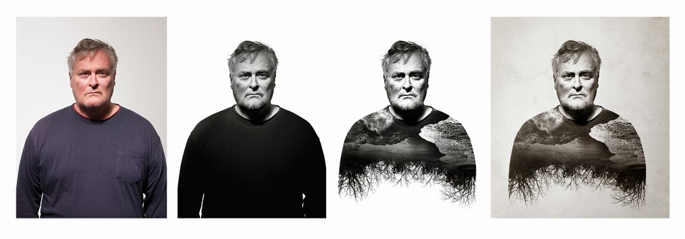 Working with the original image photographed by Robert Frith, layers are collaged to form the base image for Shrine. |
Photo retouching and manipulation
With the base images in hand, Dessein incorporated various other photographic elements (some, like the image of the New York skyline were taken by Dessein Co-Director Geoff Bickford), before enhancing and manipulating into a crafted signature series ready to be incorporated into the poster and subscriber catalogue.
Typography
While the image is one of the key design elements, the design could not be completed until the titles and additional graphic elements were included. The pattern details and layering of the design components complete the picture.
Outcomes
Understanding the process is one thing, but for any design to be effective, it must meet the client’s objectives – in this case to sell season ticket packages to subscribers. Nancy Hackett, Marketing & Sponsorship Manager for Black Swan State Theatre Company reinforces the success of the design by saying…“One of the great things about working with the Dessein team is their ability to ‘reinvent’ Black Swan’s visual identity for each new annual theatre program, while consistently retaining a strong presence of Black Swan’s company branding in all materials. The artwork for our 2013 season brochure was quite a departure from previous years. We received a large amount of unprompted feedback praising our overall season brochure as well as the intricate images for each play, which combine multiple photographs into unique pieces of art. Black Swan exceeded its subscriber growth target for 2013, gaining nearly 7% more subscribers compared to 2012.”
In addition to the BEST IN SHOW accolade, Dessein also received a PLATINUM for the BSSTC subscription brochure, a GOLD for the retail packaging of Q electronic cigarette starter pack and a SILVER for food and beverage packaging created for Great temptations Kid’s muffins in this year’s awards.


