It’s June 2018, and news has landed in our inbox congratulating Dessein…. Two of our submissions into the prestigious international packaging competition, the Pentawards, have been nominated to receive either a platinum, gold, silver or bronze award. Exactly what level of success Dessein will collect is to be announced at the gala award night to be held in New York early September.
To be honoured with an award selected from thousands of entries, against a swagger of international design agencies, judged by some of the world’s most respected design and marketing guru’s, is both humbling and exciting and fuels our passion for creative packaging.
We are proud to have won 11 Pentawards since first entering back in 2010, when Rubra urged us to enter the awards with their coffee and Kokolicious (hot chocolate) packaging. Much to our delight, they both won! Two silver Pentawards!
Everyone loves a winner, but a Pentaward win represents so much more. It acknowledges that a small studio of dedicated designers can compete against the biggest design agencies from around the world and successfully be recognised purely by their creative work and not by the size of the budget they have to complete it. The world-wide recognition the awards attracts introduces boutique studios such as Dessein to a wider audience, opening doors to potential clients who would otherwise not know we exist. In fact some of the designs we have won awards for, have been from clients who found us through these wins.
As we strike the days off the calendar waiting for the announcements of our 2 new awards for 2018, we reflect on those winning entries and outline in under 500 words (as per our entry submission) some of the features contributing to them becoming an award-winning design.
So winding the clock way back to 2010 our retrospective begins with Dessein’s packaging for Rubra’s coffee pouch series and Kokolicious hot chocolate.
2010 – RUBRA COFFEE POUCHES
Project Title: Rubra Coffee Pouches Silver Pentaward 2010
Client: Rubra Designer/s: Geoff Bickford and Esther Lee
Photography: Select photograhpy by Geoff Bickford
The Brief:
To redesign a suite of contemporary coffee pouches for boutique coffee specialist Rubra Coffee promoting the expanding range of flavours brewed by master roaster Allan McMurray.
How the Project Solution Responded to the Brief
The sophisticated design appeals to an already saturated market with a solution which does not deliver stereotypical ideas. Research into competitors product presence on the shelf, directed the design towards a clean yet original funky design solution.
Distinct coffee blends with equally distinct titles become the star of the design. Showcasing the personality of the coffee blend by integrating photographic characters into the coffee bean blend, provided an engaging design base.
Jazz, the first satchel produced for Rubra, features a saxophonist blasting coffee beans across the face of the satchel mimicking the dark intensity and richness of the coffee. Blends for Soul – a South American dancer consumed in passion, Chantico -a seductive woman bathing in a equally seductive coffee, Brazil – a Brazilian drummer beating out the flavours of Rubra and Decafé – a young man deflecting the coffee as it rains down onto his umbrella, all deliver the personality of the coffee and present as a signature collection of Rubra.
To maximize the qualities of the base silver foil material, white was printed over selective areas – allowing the Royal Show medals to be printed directly onto the foil to further enhance their metallic qualities.
To ensure the intricacy of fine type within the Rain Forest Alliance logo and Royal Show medals, a suite of PMS spot colours were used instead of the standard 4 colour process. This further enabled the use of a metallic bronze to be used as one of the tri-tone colours within the photographs and as a signature brand colour for Rubra. The combination of white, metallic bronze, black, grey and yellow provided a palette of colours that delivered the warmth and contemporary style the client was seeking.
Specifically used for coffee packaging, the three layered matt polypropylene / foil / polypropylene satchel was supplied as the preferred choice of material by the client and was printed in China.
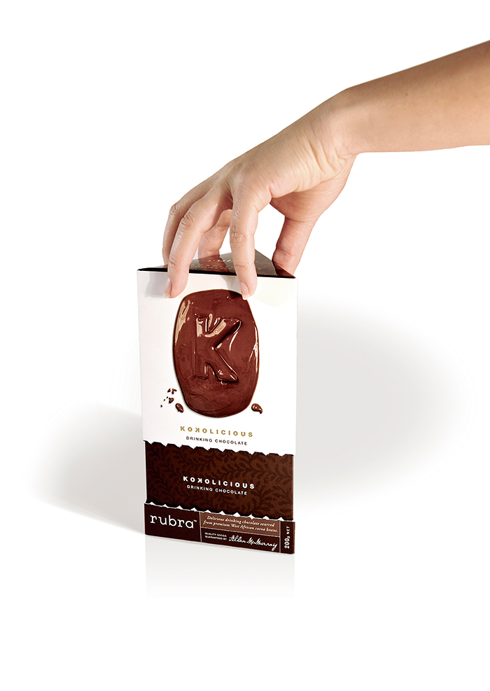
Client: Rubra Designer/s: Geoff Bickford and Esther Lee Photography: Geoff Bickford
Printer: Percival Print, Perth, Western Australia
The Brief:
To design a hot chocolate package for Kokolicious to compliment the contemporary range of tea and coffee satchels for boutique coffee specialist Rubra Coffee created by master roaster Allan McMurray.
How the Project Solution Responded to the Brief
Having completed the packaging range for the Rubra coffee and companion tea packaging, a design for the Kokolicious drinking chocolate was required which would unify the hot chocolate with the tea and coffee as the creations of a signature series by Rubra. A design revolving around the characteristics of the intense chocolate flavour was created.
Designed with a white background to match the coffee series, each tea package had an assigned colour to capture the personality of the tea – Kokolicious used the rich chocolate browns and was enhanced with gold foil type to identify it as something extra special.
Moulding the letter ‘K’ out of the surrounding melting chocolate not only portrayed the rich intense flavour of the product, but also connected the hot chocolate drink to the range of Rubra teas, which also focus on a letter – ‘T’ – shaped from tea leaves. Like the tea range, it’s unique box mechanics incorporate a tab zip opening feature, where upon opening the lid acts as a sleeve to seal in the flavour during storage.
Each package has two ‘front’ faces enabling them to be displayed singularly as either a single front or dual-faced view. Grouping multiple boxes together, the symmetry of the triangular prisms allows them to interlock and form a circle. The selection of a cast-coated card stock to print the 4 colour process design, was chosen for its economical viability and its ability to support the mechanics of the zip opening feature. A matt aqueous varnish and spot gloss varnish finish the packaging by highlighting the feature elements of the design.
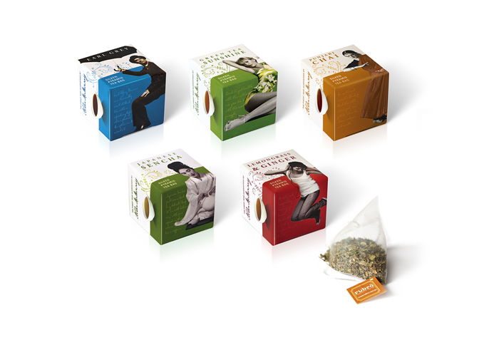
2011 – RUBRA SILKEN PYRAMID TEA BAG WRAPS
Project title: Rubra Silken Pyramid Tea Bag wraps Bronze Pentaward 2011
Client: Rubra Designer/s: Geoff Bickford Photography: Geoff Bickford Printer: Percival Print, Perth, Western Australia
The Brief:
To expand their current range of tea selections, Rubra released seven of their individual tea leaf blends as a silken pyramid tea bag option. To differentiate between the existing boxed tea leaf range and the new silken pyramid tea bag range, a different packaging solution was necessary. How the Project Solution Responded to the Brief
To retain the brand integrity and style solution from the boxed range of tea leaves, the original design features and finishes are adapted into a simple wrap design. Individual colours representing each blend are finished with matt aqueous and spot UV varnishes and incorporate a die-cut feature of the numerals 15 or 20 indicating the number of tea bags within. This also and allows consumers who are not familiar with silken-pryamid tea bags the opportunity to view the product without destroying the packaging.
To maintain freshness and longevity, the tea bags are sealed within a plastic pouch and enclosed with an outer sleeve. The outer sleeve wraps around the pouch and with a few simple folds, fastens the package with eyelets. This fastening method not only secures the product but adds aesthetics to the design.
2011 – RUBRA TEA CUBE SAMPLER PACK
Project title: Rubra Tea Cube sampler pack
Nomination Pentaward 2011
Client: Rubra Designer/s: Geoff Bickford and Esther Lee Photography: Geoff Bickford
Printer: Percival Print, Perth, Western Australia
The Brief:
Expanding their range of tea leaf selections, Rubra extended their position in the marketplace with the launch of their silken-pyramid tea bag alternative and as this style of tea bag was relatively new to the Australian market, a sampler pack introducing each of the ten varieties to consumers was required.
How the Project Solution Responded to the Brief
Sealing each tea bag within it’s own self-branded cube and compiling five into a Rubra branded sample pack provided consumers the opportunity to experience each of the unique blends on offer and enabled them to recognise the range as another quality Rubra product.
The design of each individual cube is sympathetic to the original tea leaf boxed version. The cubes feature the same colouring and photographic components as their original flavour – reinforcing the association of their blend.
Combining five cube flavours into a sample package, the word Rubra is die-cut out of the back of the package revealing each colour of the individual cubes – an eye-catching display and a strong reinforcement of the Rubra brand. The front cut-out window allowed the display of both the tea blend graphic, and the style of tea leaf. The placement of the cubes within the box also allows the box to be displayed on the shelf in both horizontal and vertical formats.
Printing the sampler box with just the one Rubra PMS colour with matt aqueous and spot UV varnishes, ensured production costs where kept to a minimum, which in turn, kept the final cost to consumers lower – an ideal way trialling a new product with minimal outlay.
Launched in time for the 2010 Christmas market, the sampler pack was an exciting addition to the Rubra range and proved to be highly successful as a gift item, with many retailers selling out soon after the initial stocks hit the shelves.
Our next Pentaward win is in 2013, and is for something quite different….
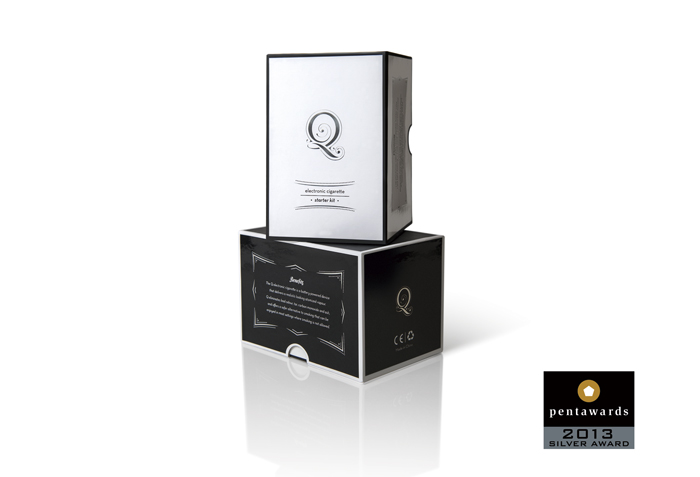
2013 – Q ELECTRONIC CIGARETTES
Project title: Q Electronic Cigarettes
Silver Pentaward 2013
Client: Dessein Designer/s: Leanne Balen and Tracy Kenworthy
Printer: Percival Print, Perth, Western Australia
The Brief:
The Q Electronic cigarette starter kit is a battery operated electronic cigarette that delivers a realistic looking atomized vapour and includes cartridges containing various levels of nicotine – an alternative for smokers as a safer way to smoke, lower their intake and also to be used as an alternative in smoke-free environments.
How the Project Solution Responded to the Brief
The kits are only sold online, and as a myriad of other electronic cigarette options are available via the internet, the design focus deliberately attempts to present the market with a sophisticated package which consumers can appreciate without the embarrassment associated with smoking and trying to quit. Fashioned with an understated elegance, the boxed units are available in both black and white and feature a silver foiled Q logo – resembling the unfurling vapour as it is exhaled. Manufactured and assembled in China, selected areas on each panel include gloss finishes subtly presenting the product as a high-quality alternative to other cheaper brands.
2013 – DESSEIN SELF PROMOTION
Project title: Self Promotion Limited Edition
Bronze Pentaward 2013
Client: Dessein Designer/s: Leanne Balen and Tracy Kenworthy
Printer: Percival Print, Perth, Western Australia
The Objective:
Celebrating 25 years of design in 2012, a self-promotional gift utilizes printing embellishments on a high quality stock highlighting print was created to gift our clients who had been part of the journey. An octagonally shaped box mimics the Dessein logo, twisting circularly and closing with an overlapping paper spiral. The paper caps on each bottle were individually hand-folded to close in the same manner. The wrap around label features typography which plays on adding the numbers together (1987- the year we began) to reach the answer of 25 (the anniversary).
To ensure the design created was timeless, elegant and befitting an anniversary, a minimalist approach to the design incorporates white and silver foiled components on a white background. Adding an explosion of fusia pink to the internal box and insert, adds a wow factor upon opening the box and reflects one of studio’s corporate colours.
The Challenges:
Numerous mock-ups were required in the development of the hexagonal box to incorporate the twisting motion into the design and ensure the folding of the top mirrored the same action. Paper was integral to the design, and the stock chosen for its textural and colour qualities, was only available in two weights. The heavier gsm produced unpleasant folding and cracking when scored, so the lighter weight stock was used and combined with a single sheet insert, which curled into itself expanding to fill the box shape and offering additional structural support to the outer box. Creating a suitable inner to strengthen the box required numerous trial versions and offered the most economical solution for the limited print run of 200.
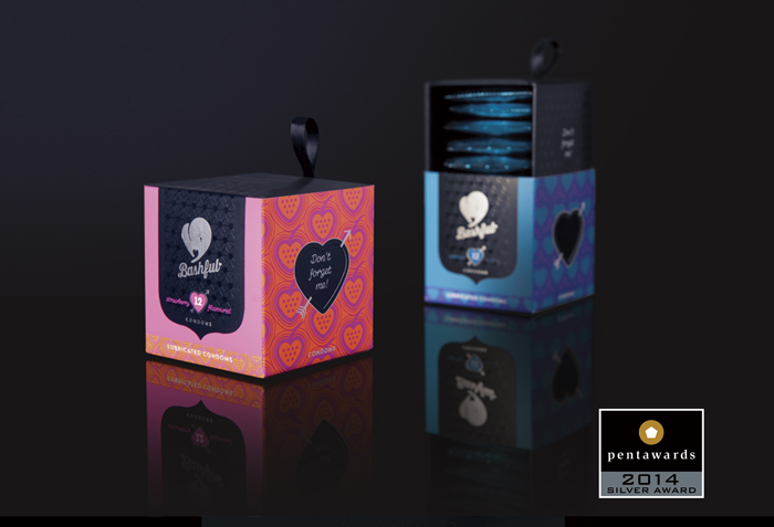
2014 – BASHFUL CONDOMS
Project title: Bashful Condoms Silver Pentaward 2014 Client: Dessein Designer/s: Tracy Kenworthy Printer:Printer: Percival Print, Perth, Western Australia
The Brief:
Condoms have often been a taboo subject for many young women as they begin their sexual journey. Not anymore. Bashful condoms aims to change the perceptions of young women and empower them with a product designed specifically to eliminate feelings of shame and disgrace. A packaging solution needs to be reflective the discrete way to purchase condoms for young women to take control and responsibility for their actions and decisions.
How the Project Solution Responded to the Brief
Embarrassment has been removed from the equation by packaging the condoms in brightly coloured units which combines fluorescent inks and solid blacks with playful patterns identifying the flavour – strawberry (hot fluro pink and orange) and premium (bright fluro blue and purple).
The packaged cube consists of three parts. An outer sleeve with all of the branding specific to the flavour, a generic inner black base box which opens discretely by sliding open at the gentle pull of the decorative ribbon and finally a sealing sticker.
The base black box has the words ‘don’t forget me’ on two sides, which peep through a die-cut heart graphic of the outer box unit as a gentle reminder and a playful reference to the Bashful logo – a stylised silver foil elephant (an elephant never forgets!). The logo embraces the gentle qualities of the word bashful and addresses the saying “There is an elephant in the room” – referring to something very obvious that no one wants to discuss – in this case the use of condoms.
The boxes are sealed with a black sticker which identifies the flavour and the quantity of condoms contained within the unit (the inner box can hold 6, 12 or 16 condoms comfortably) and by printing this information only on the sealing sticker, eliminates the need to produce a box for each quantity.
Packaging the condoms in friendly boxes with vivid colours and glossy UV heart patterns, transforms the box from something taboo into a friendly, responsible alternative for women to take control of their health without fear, retribution or ridicule.
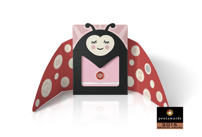
2015 – SNUG AS A BUG
Project title: Snug As A Bug Packaging
Bronze Pentaward 2015
Client: Dessein Designer/s: Leanne Balen
Printer: Percival Print, Perth, Western Australia
The Brief:
Everyone has heard of the expression – snug as a bug in a rug and the implications of feeling comfortable, warm and safe from the elements. This range of baby wraps do just that. The Snug As A Bug range has been designed to wrap around baby keeping them warm and protected from the elements. Available in 4 different fabrics of varying thicknesses – one for each season, these fully adjustable wraps feature enclosed leg and feet pockets, a hood to keep baby’s head and ears warm and 2 winged flaps which wrap around baby which are secured with a Velcro tab.
The brief required the re-design to include the ladybird from the previous brand in a package that could double as a gift box and allow customers to both see and touch the varying thickness of fabrics.
How the Project Solution Responded to the Brief
Presenting the box as a ladybug with opening wings to reveal the wrap, not only emphasizes the brand, but also demonstrates the actions of placing baby within the wrap – keeping them safe, warm and secure. Illustrating the ladybug with a simple smile, softly closed eyes, rosy cheeks and a little heart face mimics the contentness of a sleeping baby. Incorporating antennae popping out of the top of pack and the actual wrap as the belly of the ladybug is fun and engaging.
Originally, different size packaging was used for each season. The new design included a new method to fold each wrap showing the various colour combinations and an insert to allow one size pack to fit all 4 seasons and sizes.
2015 – HUNSA HEAT & EAT BANGERS
Project title: Hunsa Heat & Eat Bangers
Silver Pentaward 2015
Client: Dessein Designer/s: Leanne Balen
Printer: Percival Print, Perth, Western Australia
The Brief:
A new concept in Australia – Hunsa’s range of pre-cooked sausages (bangers) are ready for consumers to simply heat & eat within just 5 minutes. These 4 new flavours (Thai Chicken, Mexican Salsa, Polish Kransky and Spanish Chorizo) centre around the use of herbs and spices from across the world with unique flavour fusions.
How the Project Solution Responded to the Brief
Sausages are traditionally packed in plastic trays and fully visible to the customer. While the new Heat & Eat bangers are big on flavour, their appearance does not impart the complexity and depth of flavours they deliver. The addition of a sleeve sliding snuggly over the plastic tray still allows the sausages to be viewed from the side. The sleeve design centres around the colourful mix of herbs and spices surrounding the hero sausage – an explosion of impressionistic flavours designed to tantalise the tastebuds.
Food styling is integral to the design and is supported with vivid colours, patterns and typography reflecting the culinary aspects of it’s country of origin. Gloss spot UV varnishes highlight these features presenting the sausages as cooked, tasty and ready to eat.
Placed within the deli section in the supermarket, the contrasting colours of the herbs and spices exploding on their black packaging, has made them highly visible against their competitors mostly plastic-packed smallgoods, attracting huge sales and on-going repeat orders which exceeded the client’s expectations.
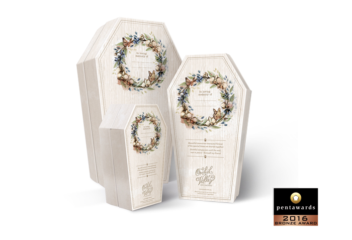
2016 – ORCHID VALLEY PET CASKETS
Project title: Orchid Valley Pet Caskets
Bronze Pentaward 2016
Client: Dessein Designer/s: Leanne Balen
Printer: Manufactured in China
The Brief:
The final departing gift any owner could bestow upon their beloved pet – a completely biodegradable casket, representing a human coffin for a bird, cat or dog to be lovingly laid to rest with dignity and respect. Create 3 different sized caskets empathic to the Orchid Valley brand name.
How the Project Solution Responded to the Brief
The caskets are currently available in three different sizes to accommodate small to medium sized pets with plans to include a jumbo-sized casket for large dogs in progress. Ensuring the caskets could be manufactured within the constraints of the cardboard sheet size, remain unassembled for easy flat pack delivery and sturdy enough to withhold the weight of a medium sized dog without collapsing was challenging.
To overcome these restrictions the caskets are constructed as three separate components – a base, an inner liner and a lid. The inner liner strengthens the overall casket structure and acts as the closing mechanism for the lid to sit on. The e-flute corrugated board uses no gluing or stapling in the construction, instead, simple interlocking features help to strengthen them and make them cost effective and environmentally friendly.
The design of the casket itself follows the clients request for a shabby-chick look. A water-coloured wreath of native orchids (after the client name Orchid Valley), eucalypt leaves and butterflies, laid atop of a wood-grained base, accompanied with the words… In loving memory of… with space for the pet name to be written. A short farewell poem completes the design, is printed offset and laminated to the board.
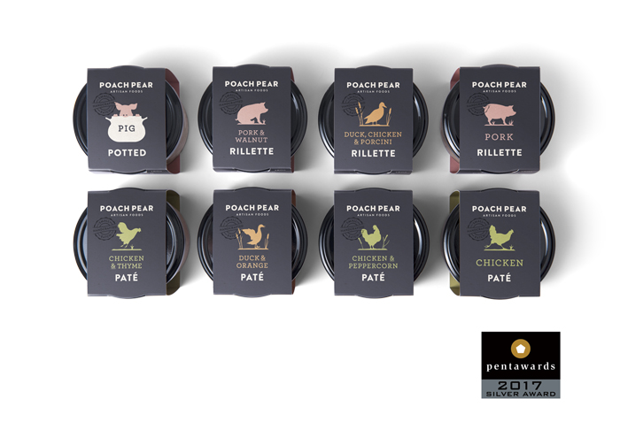
2017 – POACH PEAR
Project title: Poach Pear Packaging
Silver Pentaward 2017
Client: Dessein Designer/s: Geoff Bickford
Printer: Percival Print, Perth, Western Australia
The Brief:
Poach Pear is an artisan producer of hand-made charcuteries created in small batches to ensure premium quality produce. The brief asked for a revitalization of their shelf presence with refreshed packaging reiterating the quality of the Poach Pear brand. Sold in reusable glass jars has proven the best way to present and preserve the pates & rillettes, and while a string and swing-tag solution around the lid of the jar was initially successful, Poach Pear felt it didn’t represent the brand qualities and traditional French methods of how they are made. The terrines were packed in vacuum-sealed packs, labelled with a sticker and displayed horizontally – meaning they weren’t necessarily able to be displayed alongside the jars.
How the Project Solution Responded to the Brief
Displaying the terrines in an alternating zig-zag arrangement, tapered shaped packs are placed upright on the shelf and a pear shaped die-cut window reinforces the brand while showcasing the produce. Simple silhouetted illustrations and a muted colour palette allow the artisan qualities of the brand to shine. The design is also adapted to become wraps for the jars of pate. By replacing the swing-tags with the sleeve, the jars expand the brand presence with the provincial design featuring playful silhouette illustrations representing the primary protein etc.
* The packaging also received a first place in the 2017 Dieline Awards.
And finally we can proudly announce in 2018, two more Pentawards were awarded to Dessein.
Drum roll please….
2018 – PURABON
Project title: Purabon
Bronze Pentaward 2018
Client: Dessein Designer/s: Leanne Balen
The Brief:
Health food company Purabon produces a range of healthy protein and Paleo Protein balls in three flavours; salted Caramel, Peanut Butter and Hazelnut Cacao. With a focus on vegan, gluten free, dairy free and no added sugar, Purabon knew they wanted a design which broke away from the conventional ‘primal’ concept thinking usually associated with Paleo and whole-food snacks, and looked for a design which would be both as exciting and enticing as the highly nutritional protein balls tasted. Wrapped and sold individually in cafés, juice bars, fitness centres and health food stores from point-of-sale boxed units, the three flavours needed to be easily identified within the Purabon family of products.
How the Project Solution Responded to the Brief
Targeting a demographic of both the health conscience and active trendy hipster, an original design with character and appealing to each required a fresh approach.
The solution was to build a design based on ‘at the heart of the Purabon brand is temptation without the sin’. Custom illustrations encircle and entwine into a heart holding the Purabon Protein Balls title framed with edges of primal colours to determine the flavour. Illustrations of birds, bees, snakes, flowers, butterflies and apples, sprout concepts of Adam & Eve and the garden of Eden. Complex and simple simultaneously, the resulting design resembles a sophisticated tattoo art style of happiness and good health.
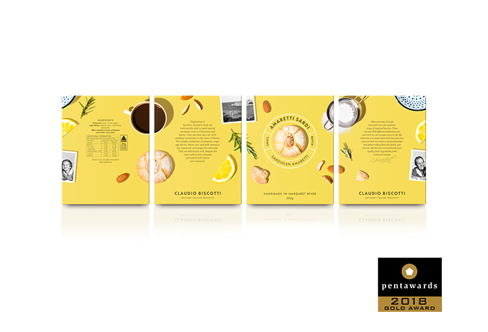
2018 – CLAUDIO BISCOTTI
And now, for the very first time we are very excited to announce we have won our first GOLD… for:
Artisan Italian biscuit maker Claudio Biscotti has over 400 different authentic recipes for his range of regional Italian biscuits – each as distinct as the region from which they originate. Truly hand-made in small batches, Claudio Biscotti entered the retail market with five of his favourite biscuits. Presenting them in packaging which embodies the same values of love and care imparted by the hand-made process and presenting them as both a gourmet treat and artisan gift was imperative.
How the Project Solution Responded to the Brief
A two-part box provides the solution. Rose gold foil embellishes, elevates and brands the range – Claudio Biscotti – a sophisticated rose gold foiled seal sits atop of the first, upper box with a cookie-cut shape die on the front face. This generic box is shorter and sits over the larger, second base box for each specific biscuit. Simple photography heroing the product peeps through the front cookie-cut die of the top box while the ingredients, a personal message from Claudio and separate product description also appear through separate die-cut windows around the sides of it.
The experience of gifting is emphasised as the top box is lifted and reveals the coloured base box featuring cameo’s of the key ingredients, highlighting the distinct flavours and story behind the biscuit name, history and best way to enjoy them.
Colourful, distinctive and contemporary without compromise to the integrity of the traditional values of the product the packaging as elevates the user experience of unboxing before experiencing the joys of the biscuits themselves.
And that, as they say, is a wrap. 13 may be an unlucky number for some, however when it comes to Pentawards, we will gladly accept number 13….. a Gold one at that!